Pure
Building a world and a scientific mythology around a supplement, because purity is a claim and discovery is a story.
Case Study
problem
The supplement industry has become a marketplace of noise, oversaturated with brands competing on spectacle and statistics rather than substance and soul. Most products are also diluted by unnecessary fillers and artificial compounds, obscuring their potency. Consumers are left unable to distinguish genuine quality from carefully packaged mediocrity. Standards have collapsed. Trust has followed.
solution
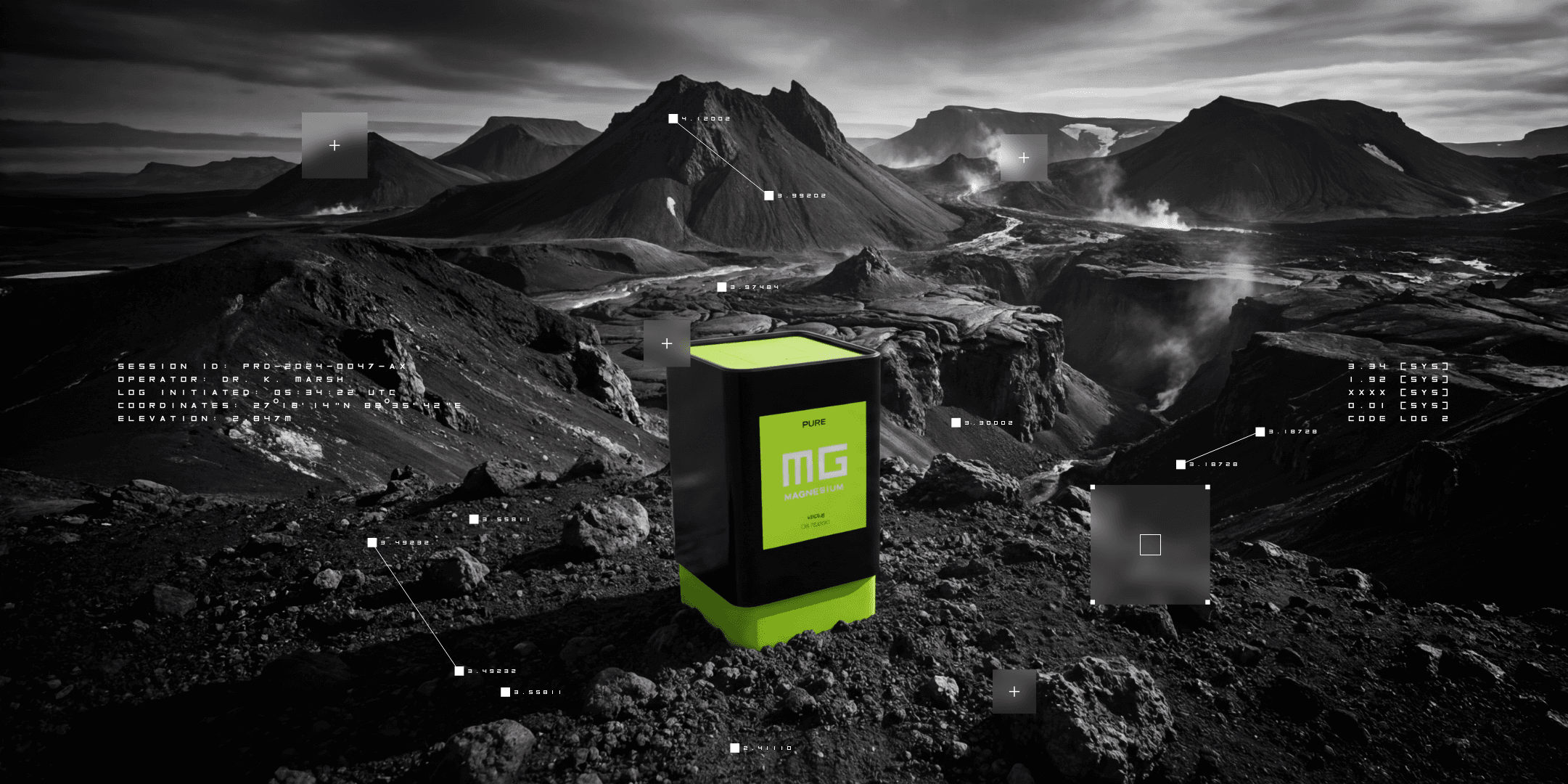
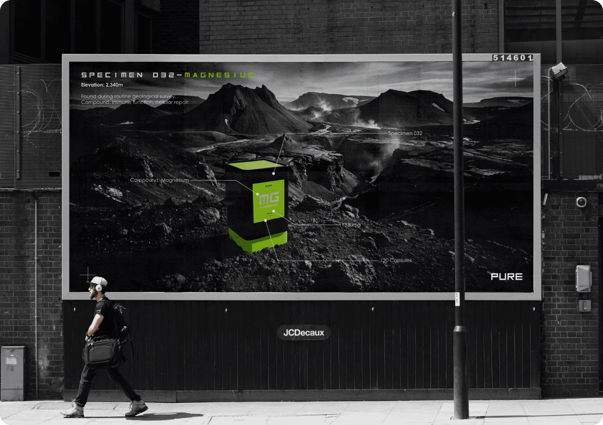
The solution was to take a new direction and start telling a story. Pure isn't manufactured, it's recovered — a research division, a field team, a cave at 2,847 metres where the specimens logged at 0.003% contamination and nobody could explain how they'd formed that clean. Nothing in the campaign tells you the product is pure. The world around it simply behaves as though that was settled long ago.
The Irish ads that I grew up with rarely sold you just a product. They sold you a world, a soundtrack, a feeling, and the thing came with it. I wanted to do that to a vitamin.
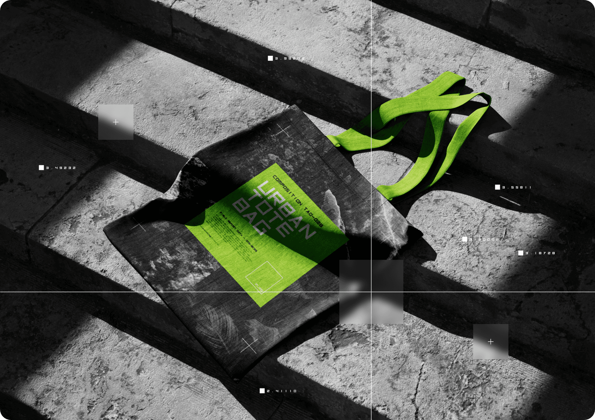
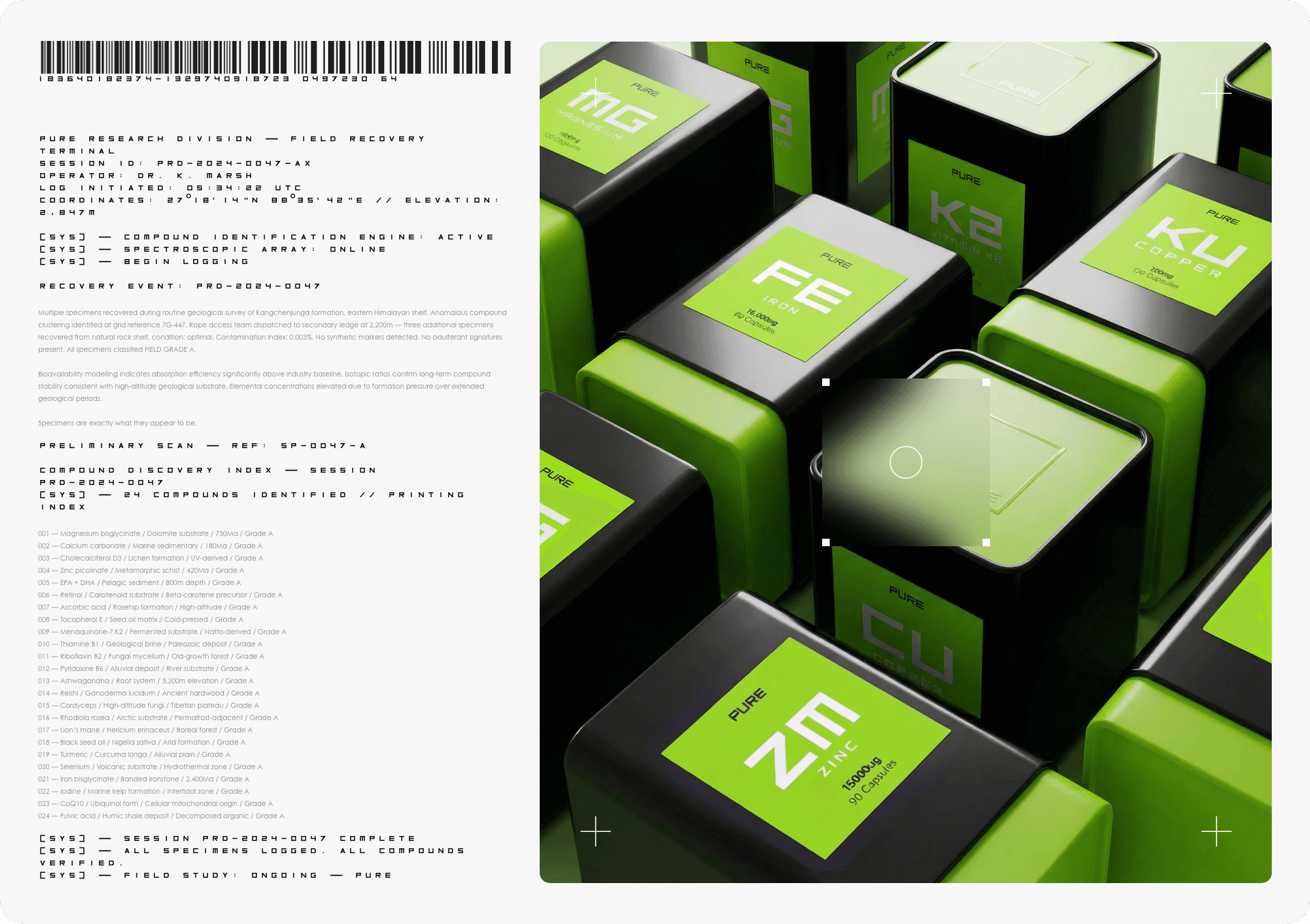
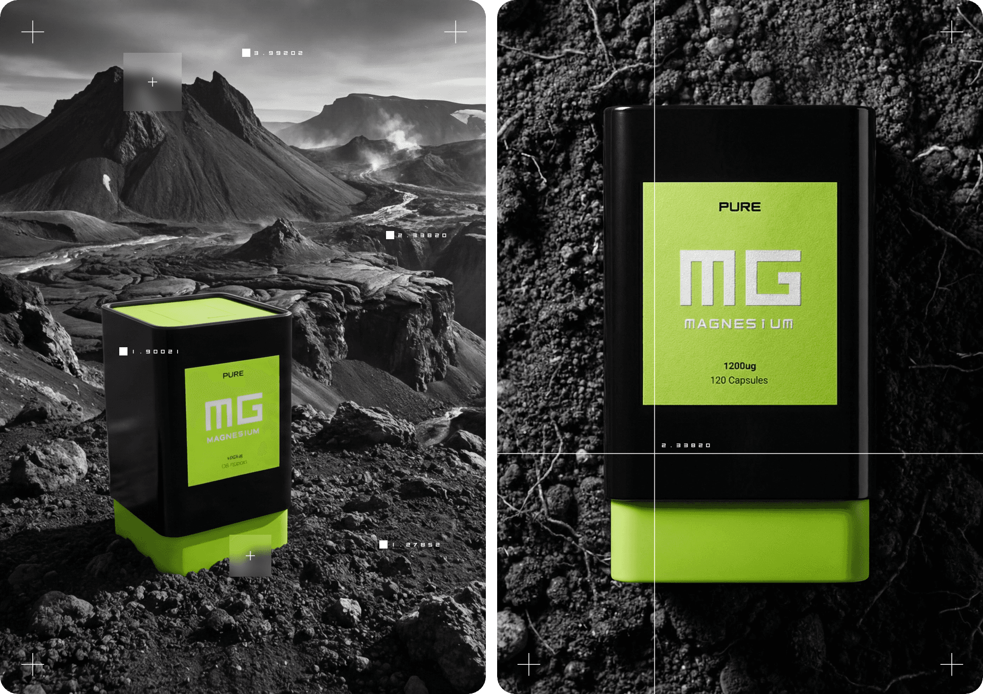
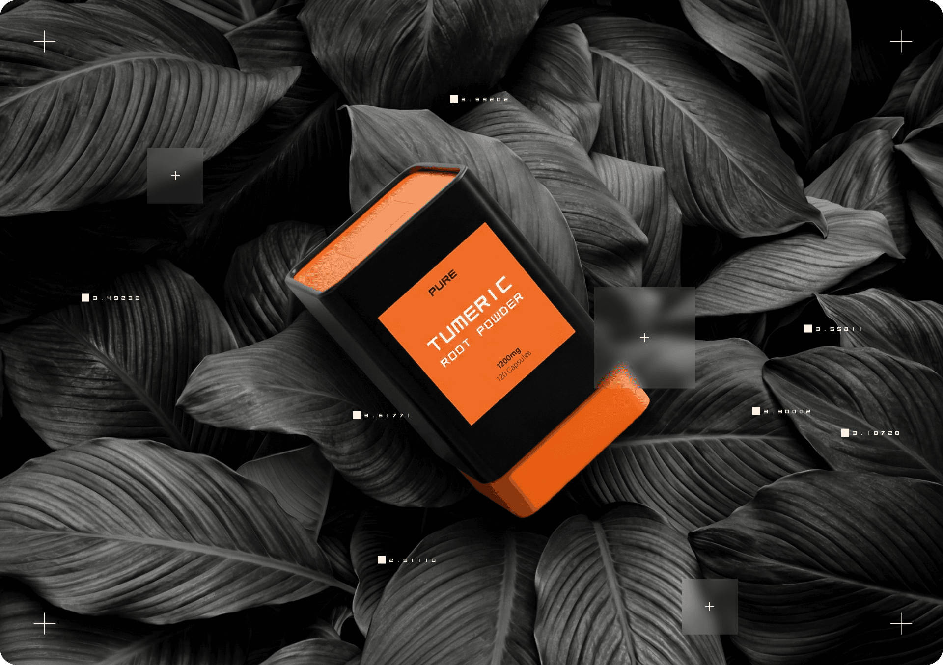
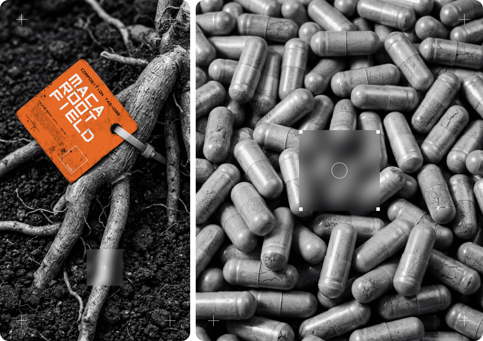
The commitment to the world is what makes it work. A field report is only convincing if every part of it holds — so the system includes encrypted transcripts between the field team and base, a compound discovery index running to twenty-four numbered specimens with substrate and geological age, session IDs, elevation data, contamination percentages. It's absurd read aloud and completely coherent once you're inside it, which is exactly how genre fiction functions. Build the rules properly and the audience stops checking them. One directorial rule holds the visual world together: everything monochrome except the product, so the containers appear embedded in volcanic rock and cave systems rather than composed against them, pushed forward by colour alone. Over the top sit coordinate crosshairs, specimen tags, barcode strips and field notation, the grammar of evidence rather than persuasion.
The system was designed to keep running after the story is told. Colour codes the range rather than the brand — green for magnesium, orange for the root extracts, blue for the health blend — so the category reads before the label and new compounds slot in without redesign. The packaging carries the fiction into the object: square-profile recycled containers that read as industrial specimen housing, a sleeve-style sliding closure rather than a screw cap, so opening one feels like handling a find. And the narrative device scales indefinitely. Every new product is another recovery, another log, another coordinate, which means the brand generates its own content for as long as the range expands.
status
Developed as a pitch, presented and well received, but not produced — the client's budget didn't extend to a full brand build. Shown here with the name changed to protect their identity.
year
2025
timeframe
9 days
tools
Photoshop, Blender, Figma
category
Packaging and storytelling
00

01

02
03

04
05
06

07

08
09

10
11