Me Lugë
Building a visual identity for a local restaurant specialising in Kosovar cuisine.
Case Study
problem
A self-set brief: build a brand for Kosovar cuisine in Berlin. There's a large Albanian community here and almost no restaurants representing it. The challenge was speaking to two groups at once — people who grew up with the food, and people who've never heard of it — without making it feel closed off to one or watered down for the other.
solution
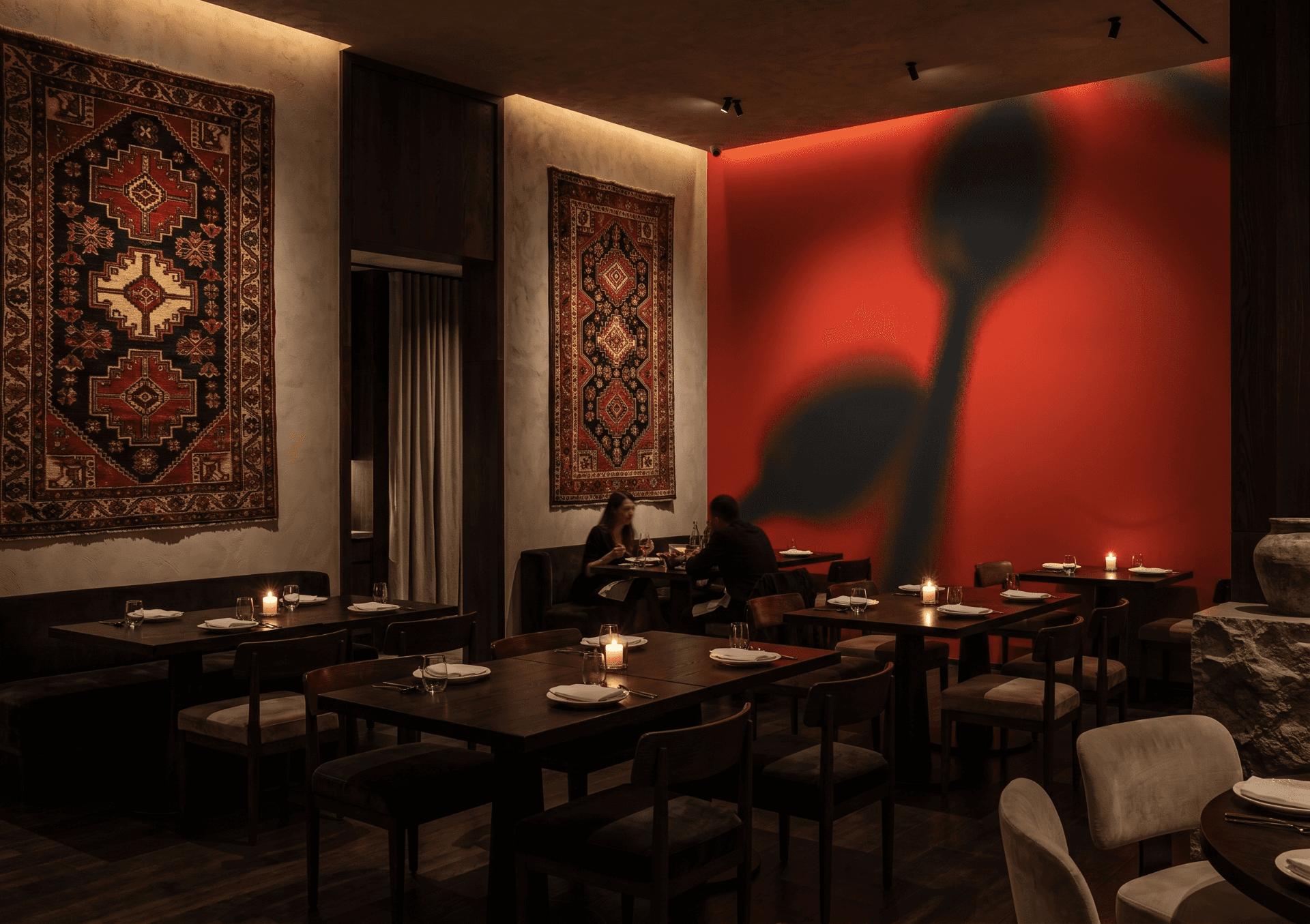
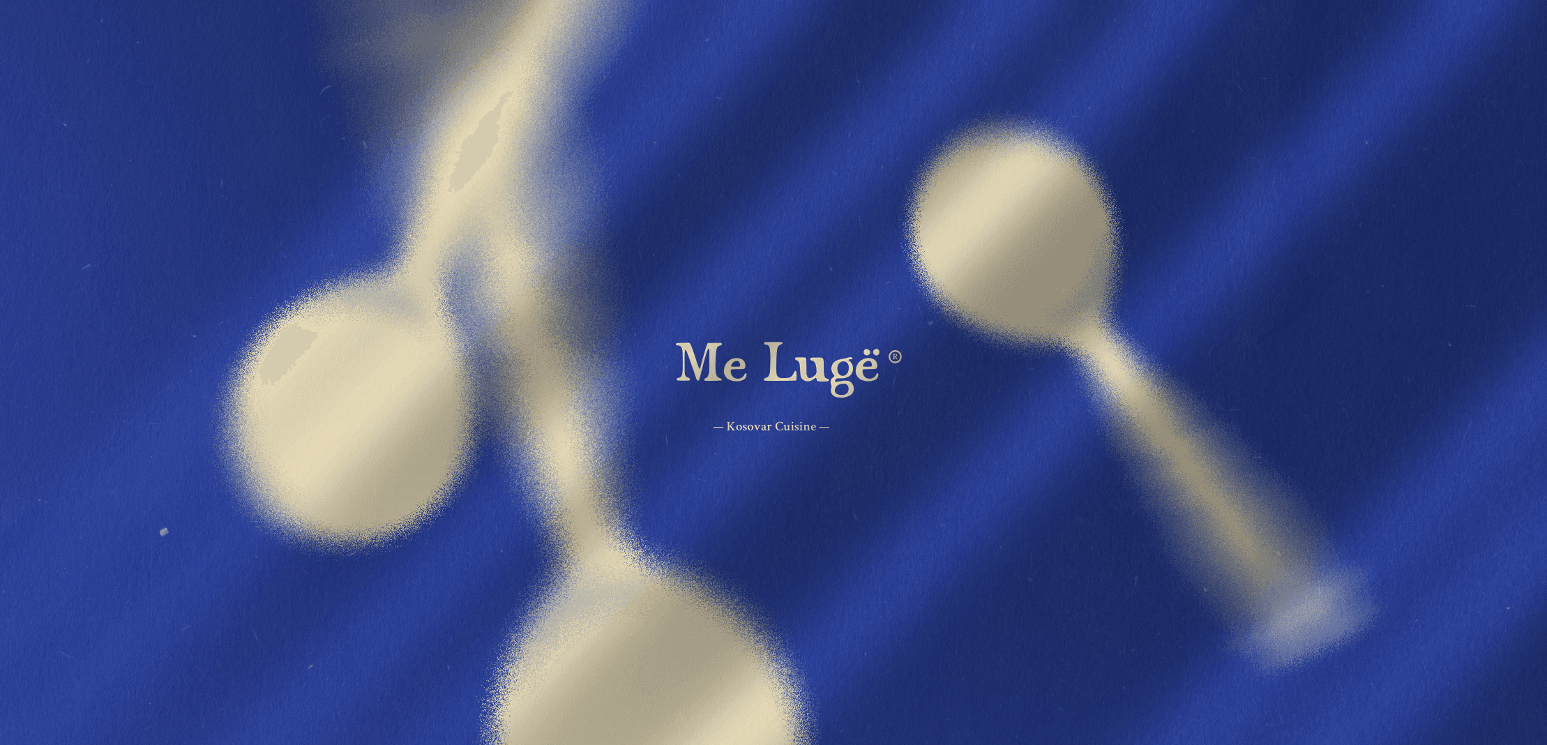
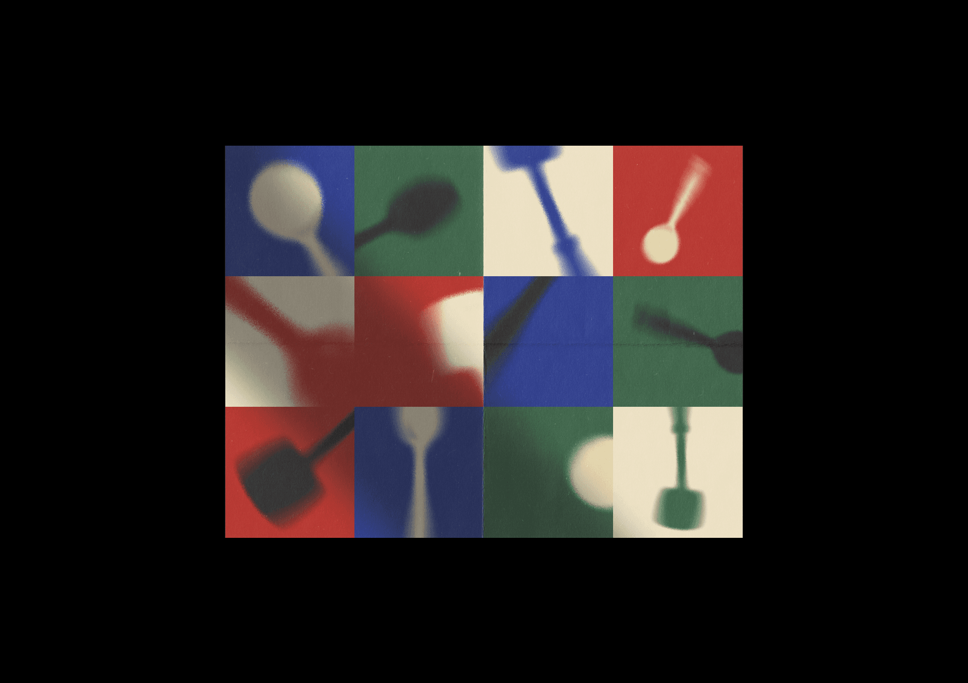
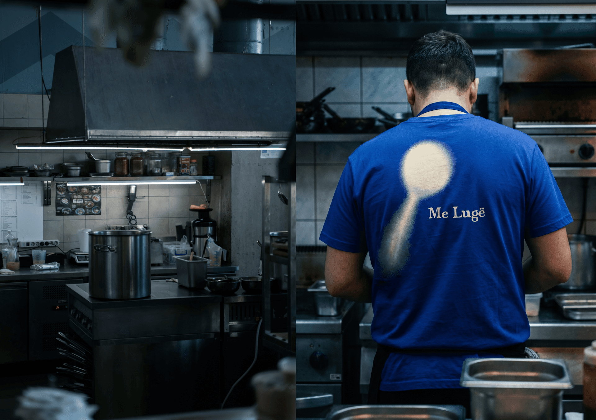
The brand centres on a single object: the spoon. In Albanian, lugë. Simple, universal, and deliberately humble, it became the cornerstone of the entire identity. Rather than just illustrating it, the spoon was expressed in motion and treated with grain and blur, giving the visual mark a sense of kinetic energy mirroring the lived experience of Kosovar culture and a diaspora that never stops moving.
The grain and the blur are doing the cultural work. The spoon is just the carrier.
Every decision ran through one question: does this make Kosovar culture look vivid and confident, or does it make it look like a discovery for outsiders? The motion treatment is the answer to that. It carries the energy of a community constantly in movement — abroad, through work, back home — and it means the mark reads as alive rather than curated. The colour system runs five values across two tiers: cobalt blue, signal red and forest green each doing distinct work so the palette never flattens into decoration, with a warm off-white and a near-black as the surfaces everything sits on. Rich without busy, rooted without cliché.
The spoon does the decorating everywhere. On a menu it's a graphic element; on a wall it's the same graphic element at ten times the size, and neither needs anything else around it. That only works because the form is simple enough to carry weight on its own — a spoon is one silhouette, instantly readable at any scale, so it can be cropped, repeated, blown up past the edge of the surface and still hold. The identity never needs a secondary pattern or a supporting graphic language, because the mark is already both.
background
Self-initiated. A design exercise built around a cuisine I have a personal connection to, with no client and no brief. Months later I was in Kosovo, walked past a restaurant called Me Lugë, and went straight in. The owner was as surprised as I was that we'd landed on the same name independently. I offered him the identity and a website for nothing. It never went anywhere, but the coincidence was too good not to keep.
year
2025
timeframe
14 days
tools
Affinity Designer, Figma
category
Hospitality branding
00
01
02
03
04
05
06
07
08