Nucleus
Building audio hardware for my own film scoring work, and then designing the product and brand identity to take it to market.
Case Study
problem
Granular processing is one of the most expressive things you can do to sound, and it's priced like a luxury. The devices that do it well sit at the top of the boutique market, and the ones that are affordable bury their depth behind shift functions, sub-menus and colour-coded button combinations that need a manual to decode. Both failures have the same effect. The moment a musician has to think about the interface, the instrument has stopped being an instrument.
solution
Nucleus exists because I needed the device and couldn't buy it. Working in film soundtrack composition, I sourced the components, built a working prototype around a Daisy Seed, and wrote the firmware to run it. That prototype is still in use on my own scoring work. The brand came afterwards, built from the product rather than applied to it, once the thing had proven it should exist.
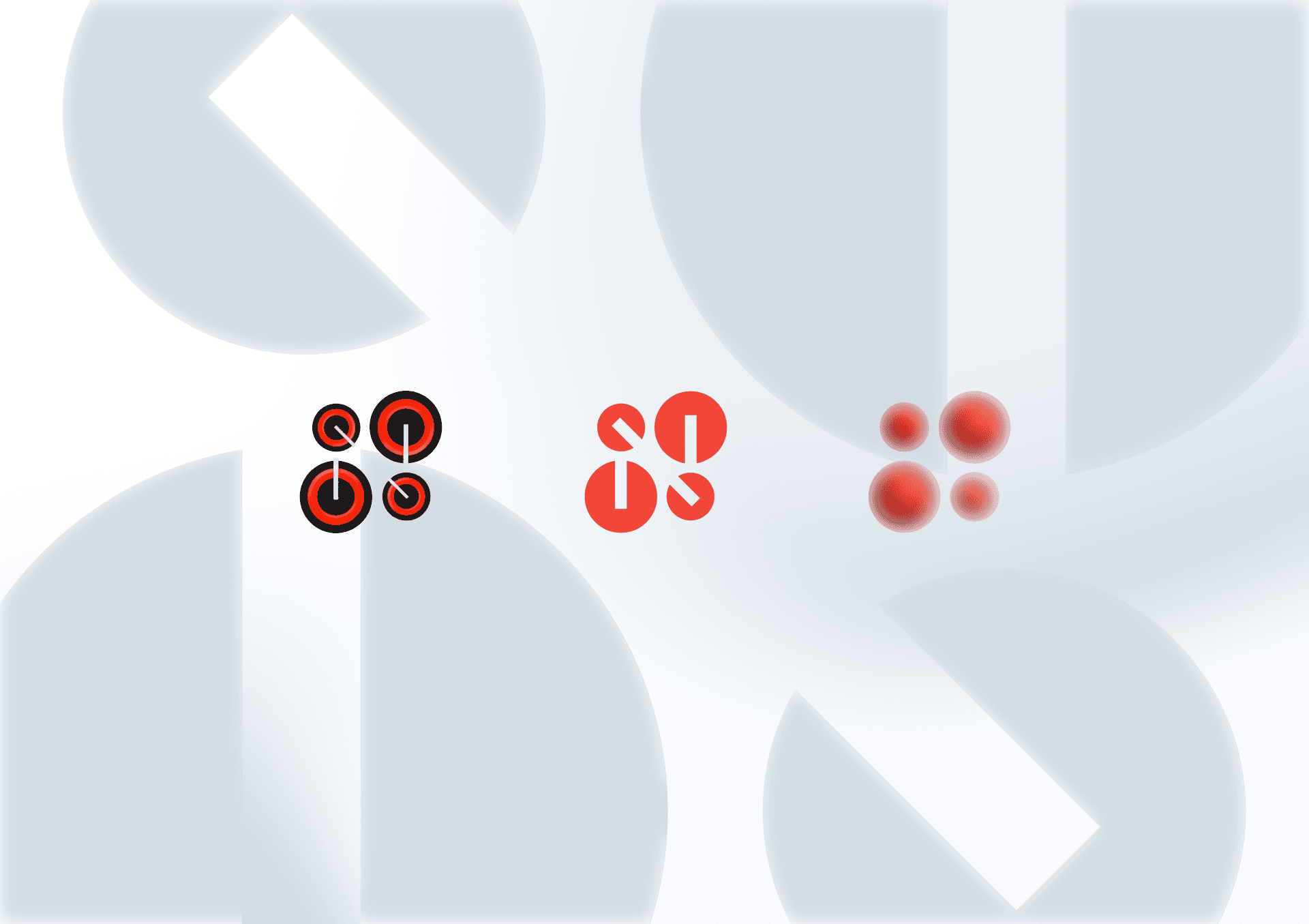
The identity is knobs, arranged as atomic structure, at every scale the brand needs.

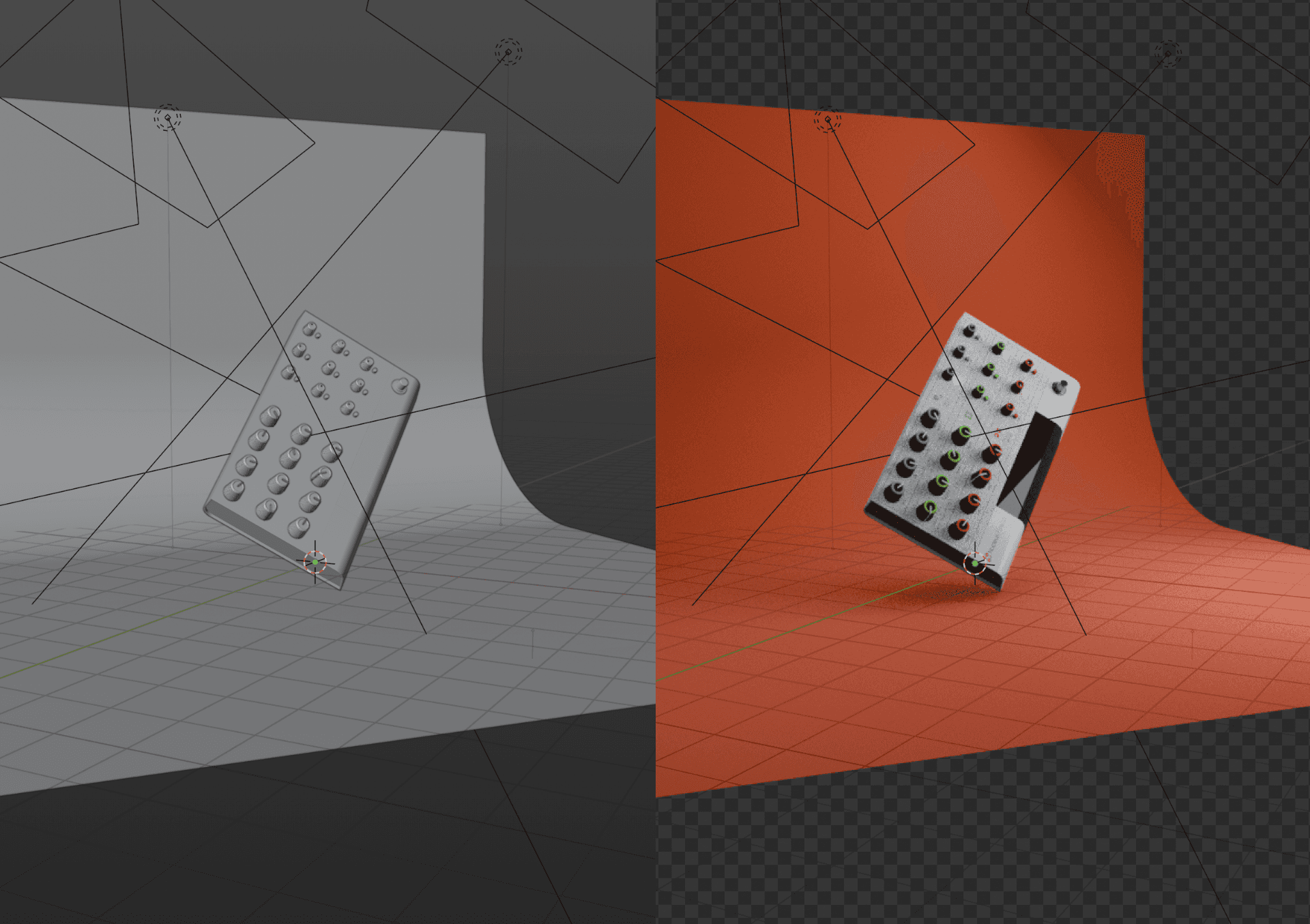
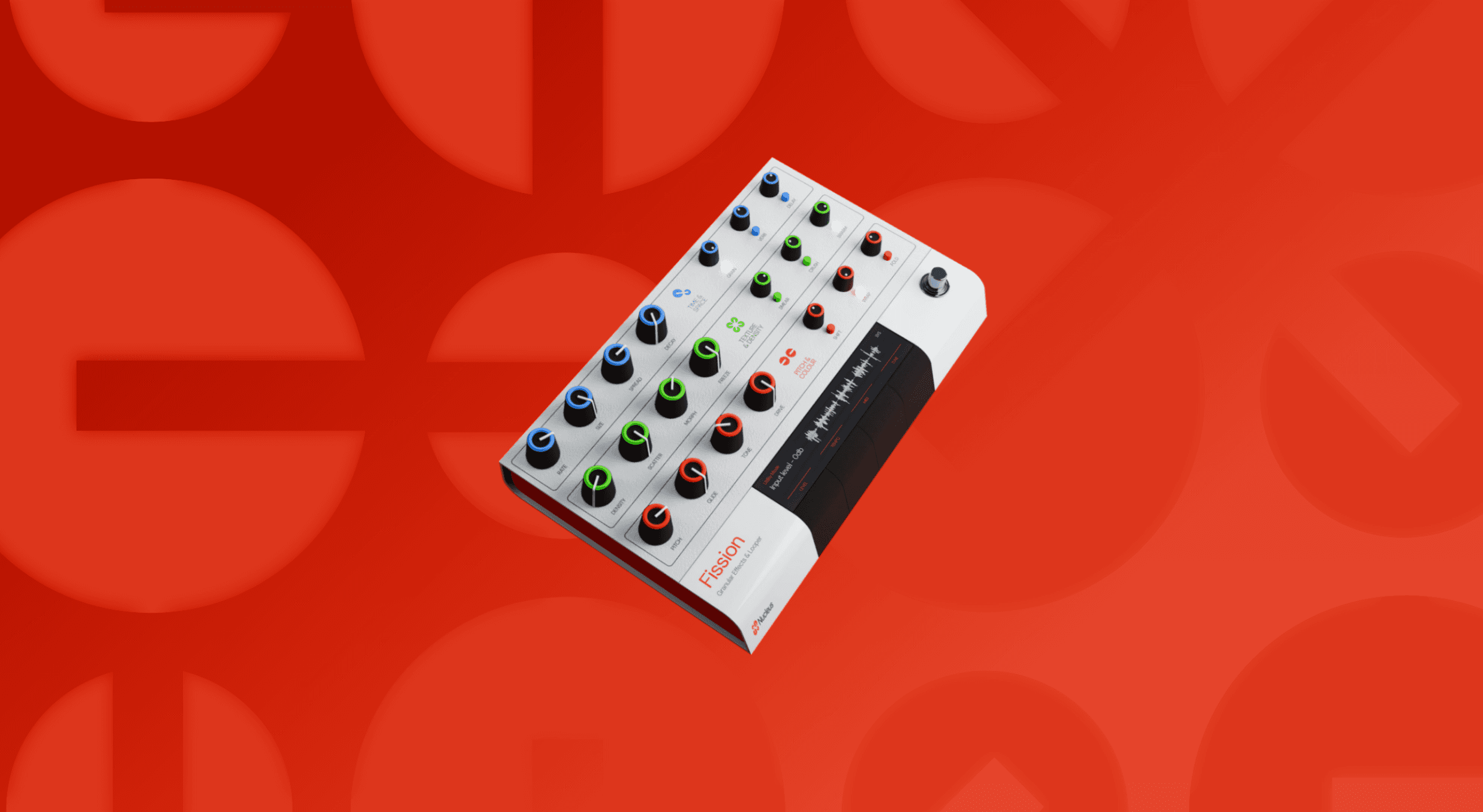
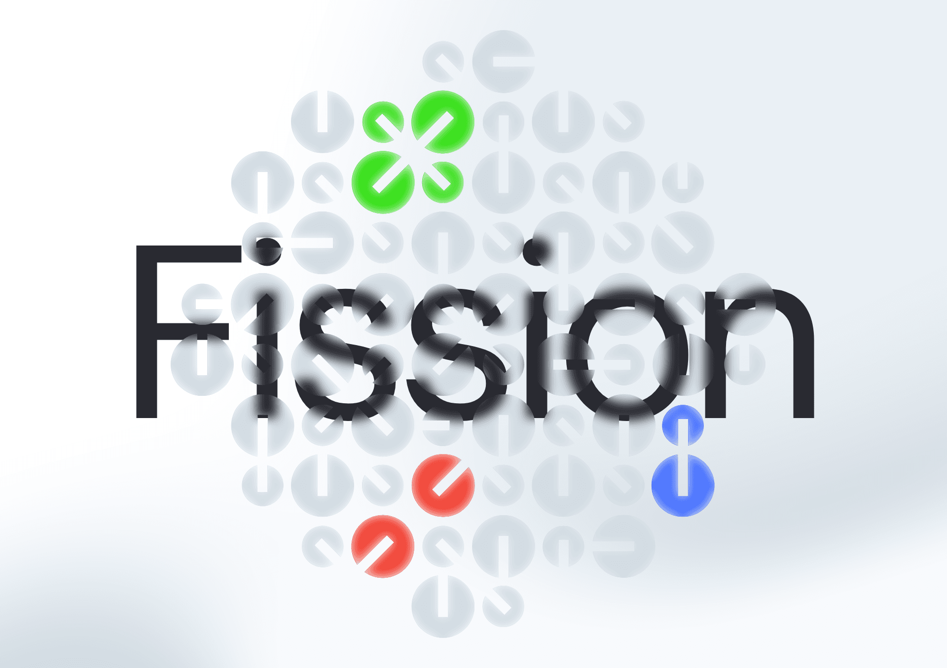
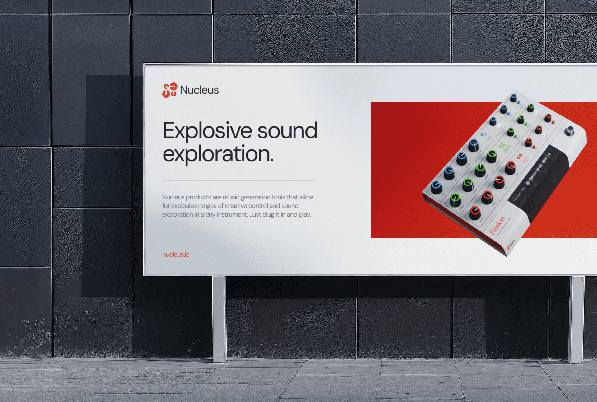
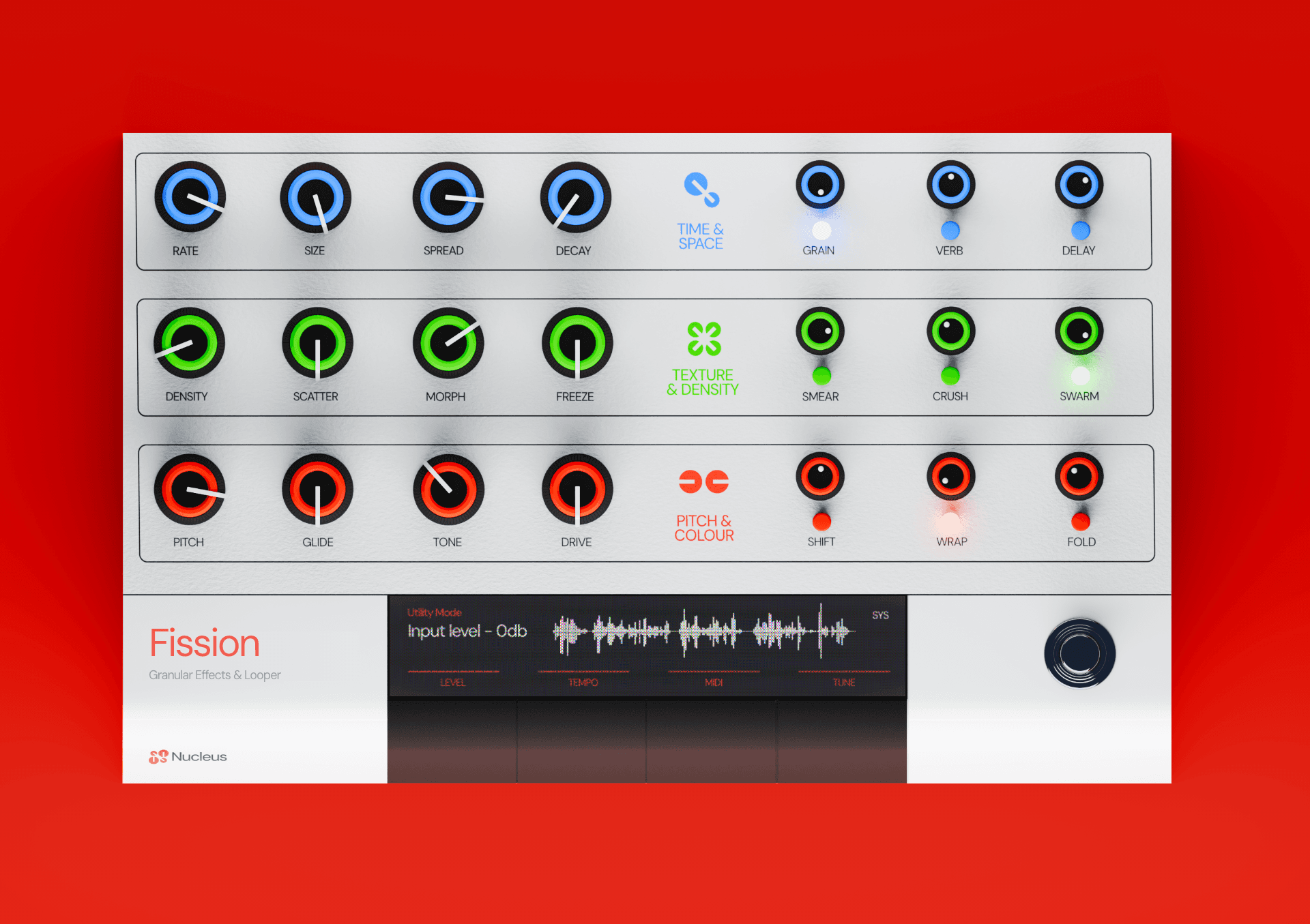
Fission is the first Nucleus instrument, a granular effects processor and looper with nine chained effects and twenty-one dedicated controls. The design brief was a single constraint: total physical transparency, no parameter more than one hand movement away. That produced the panel architecture — three rows, each its own effects domain, each colour-coded so the layout reads without annotation. Blue for time and space, green for texture and density, red for pitch and colour. A player finds what they're reaching for by domain, not by memory, and the LCD carries the system-level complexity without ever surfacing it on the panel.
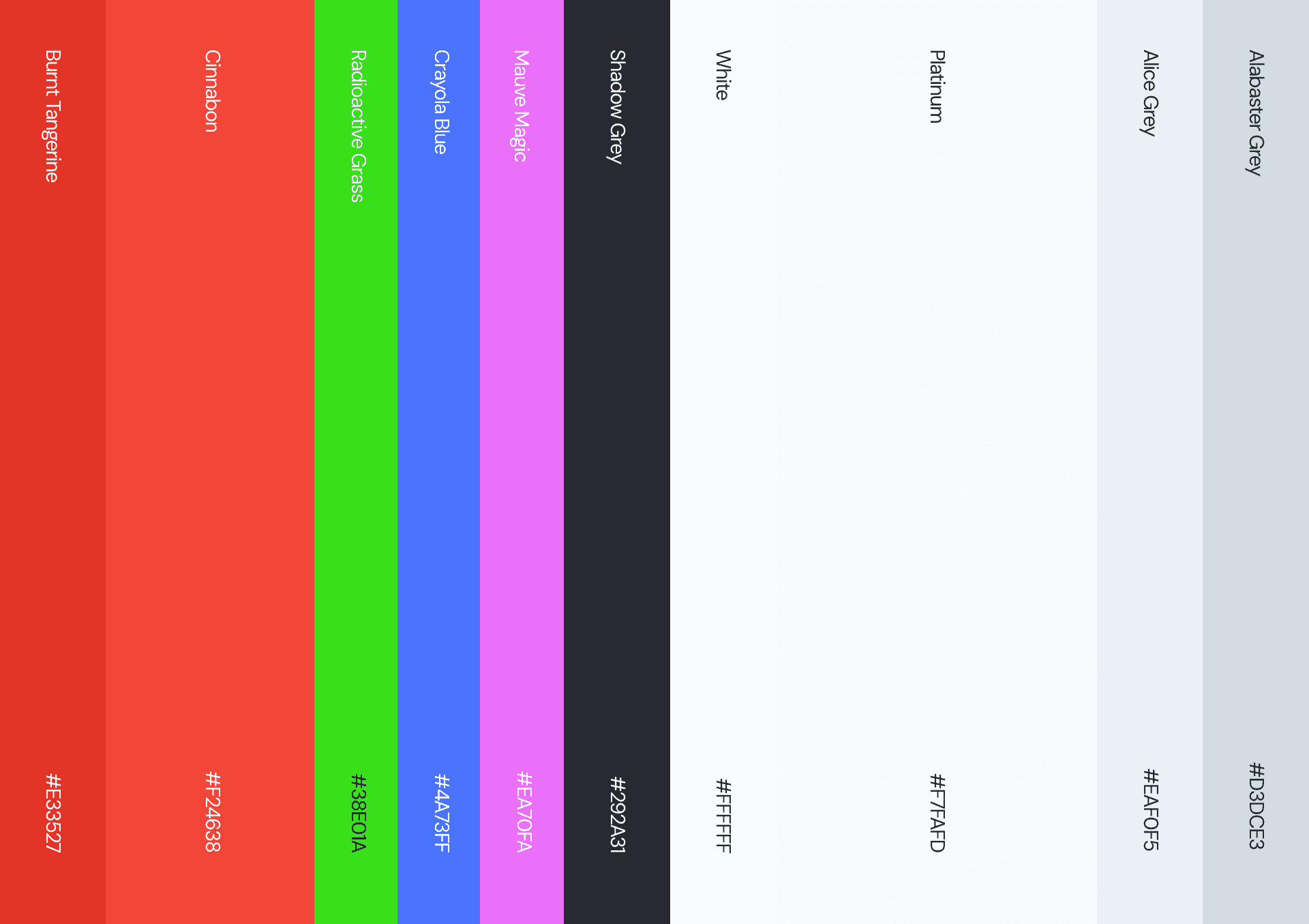
The identity came out of the hardware rather than sitting on top of it. Sound behaves the way physical systems do, in chains and reactions where everything downstream is altered by everything upstream, which named the company and the product line — Fission first, Proton next. The logo is drawn directly from the knobs: four circular forms that compress into an N and read simultaneously as an atomic diagram and as the components themselves. The brand red was the product's accent before it was the brand's, taken from the third row and extended outward. Nothing in the identity is a metaphor for the product. It's all made of the product.
status
Prototype in development for early 2027, launch late 2027. The working device has been in use on scoring projects since the original build. Now in production development with a programmer and an industrial designer, with the goal of delivering granular processing at a fraction of the current market price. Success is measured against unit cost against comparable boutique hardware, and against getting the instrument into the hands of musicians priced out of the category entirely.
year
2026
timeframe
1 month
tools
Affinity Suite, Blender, Figma
category
Product and hardware branding
00
01
02
03
04
05
06
07
08
09