The European Union
Dismantling institutional design language to make young Europeans care about the EU again.
Case Study
problem
The brief arrived with an institutional voice already baked in, and that voice was the problem. EU campaign material had trained an entire generation to look away: sterile, corporate, and visually neutered. Designing for youth engagement meant the first creative decision wasn’t what to make. It was what to demolish.
solution
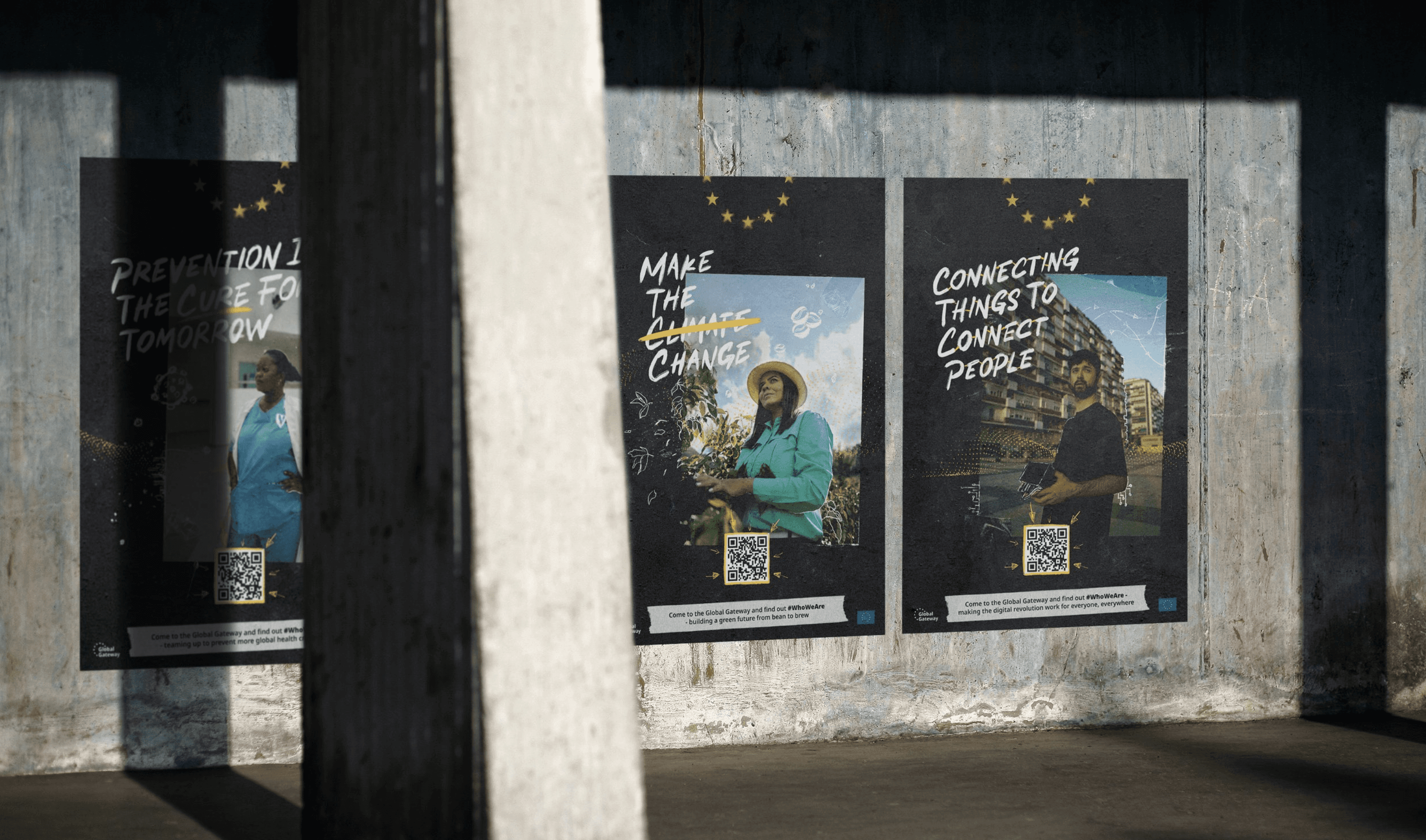
I scrapped the institutional register entirely and built a visual language that spoke before it explained: collage, graffiti, handwriting, grain. Art direction designed to look like something a young person made rather than something a committee approved. The EU, rendered in a voice its audience could actually hear.
Four real people. Four corners of the world. One institution most young Europeans had already written off. The challenge wasn't awareness, it was trust. And trust doesn't come from polish.
The audience had already made up its mind, and that conditioned response was the real constraint. So the art direction abandoned polish as a value: photographs sellotaped to surfaces, handwritten annotation, graffiti lettering, rough composition. Not disorder for its own sake, but fluency in the visual language of the people being addressed. It was a risk on an institutional account, and it was the only route that stood a chance of being looked at rather than looked past.
The content was four real consequences of EU involvement that the institution's own communications had made invisible: an Argentinian video producer who relocated to Spain on EU-built digital infrastructure, a Malaysian student on Erasmus in Berlin, a doctor whose community received EU support during the COVID response in Dakar, a Guatemalan coffee farmer sustained by agricultural partnerships. The documentary direction followed the same rough grammar as the print — handheld, unfiltered, street-level. Every poster and film carried a QR code into a metaverse environment structured around the campaign's four pillars, each with its own 3D exhibition space. That was the funnel: street to screen to participation.
results
1,000+ visitors entered the metaverse environment — the campaign's primary objective. Wildposting and OOH ran across 27 countries. 23,000+ impressions across print and digital. 5,000+ views across the four documentary films.
year
2023
timeframe
2 months
tools
Photoshop, InDesign, Procreate
category
Campaign and art direction
team
Winnie Tsang, Nicolás J. Scatamacchia. Sakhawat Biton, Fernanda Thieme, EASYDOESIT, Louise Amelie
00

01

02

03

04

05

06

07

08

09

10

11

12