BRINK-BERLIN
Wellness branding stripped of decoration. Just warmth, stillness, and deliberate cognitive ease.
00

problem
Wellness branding has a default setting: cursive lettering, soft botanicals, aspirational holiday light. It signals relaxation without producing it. Designing for a genuinely burned-out Berlin audience meant that aesthetic was not a starting point — it was a trap. The work had to feel like relief, not a resort brochure.
solution
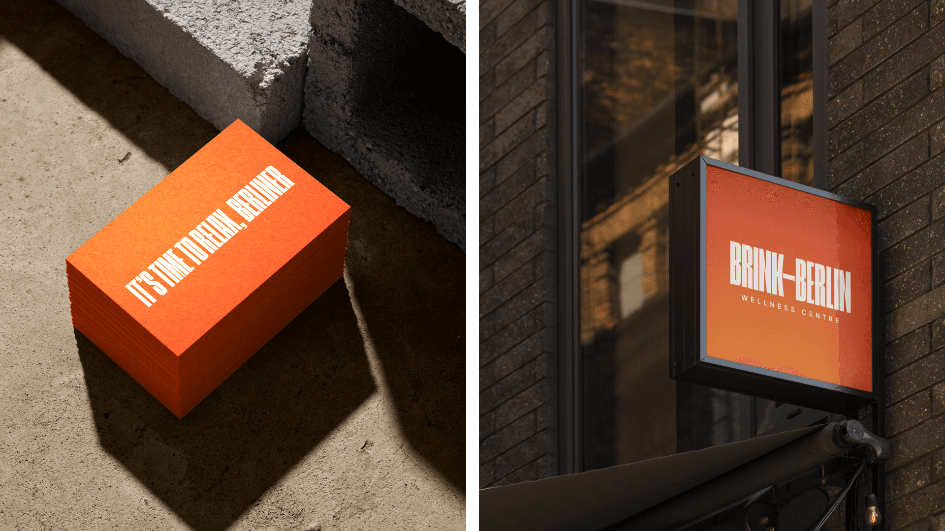
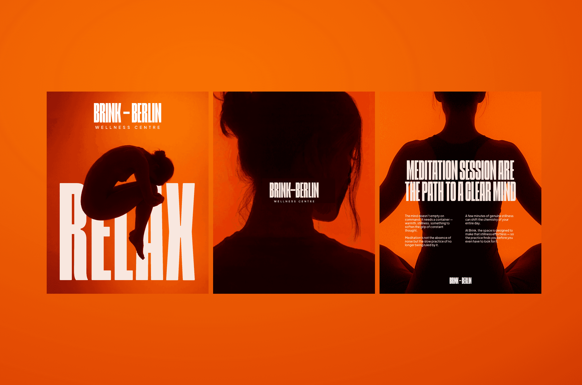
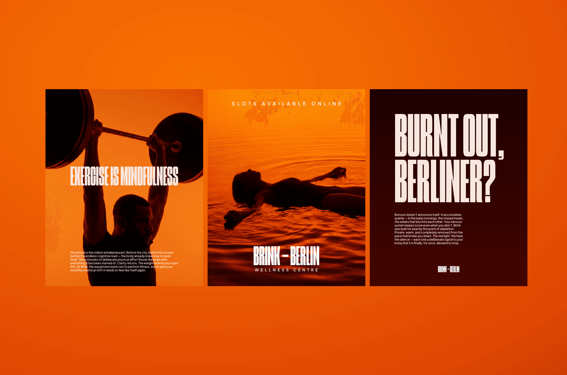
I built the identity around absence rather than decoration. Deep orange voids, brutalist type, and cinematic expressionist photography — a visual world that asks nothing of the viewer except to step inside it. Every design decision was made with one question: does this reduce cognitive load, or add to it? The brand became the experience before the door opens.
Berlin burns people out. It is fast, grey, relentless, and merciless with your energy. Brink needed to feel like the opposite of the city outside its walls — not just a spa, but a complete suspension of the world you walked in from.
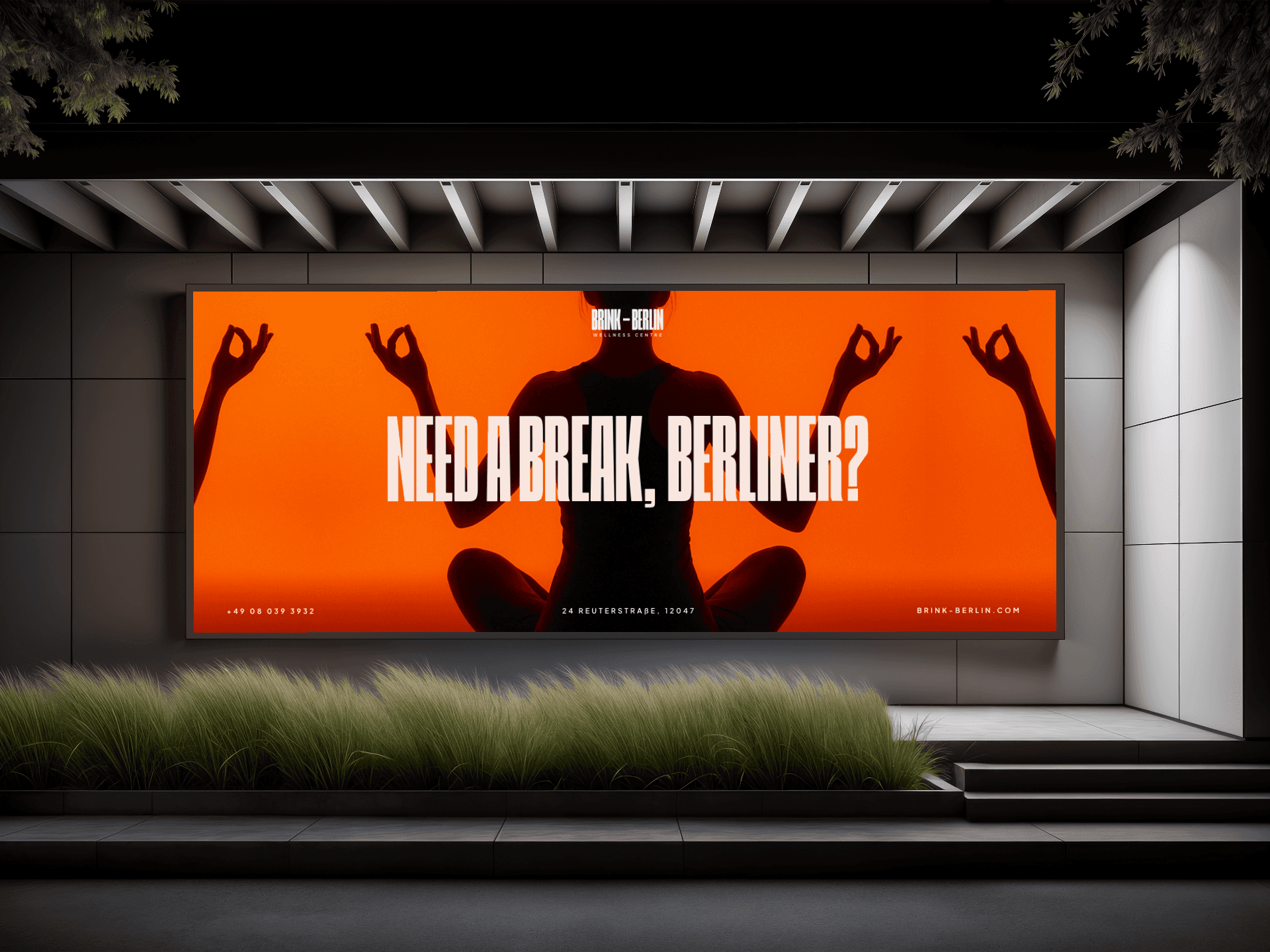
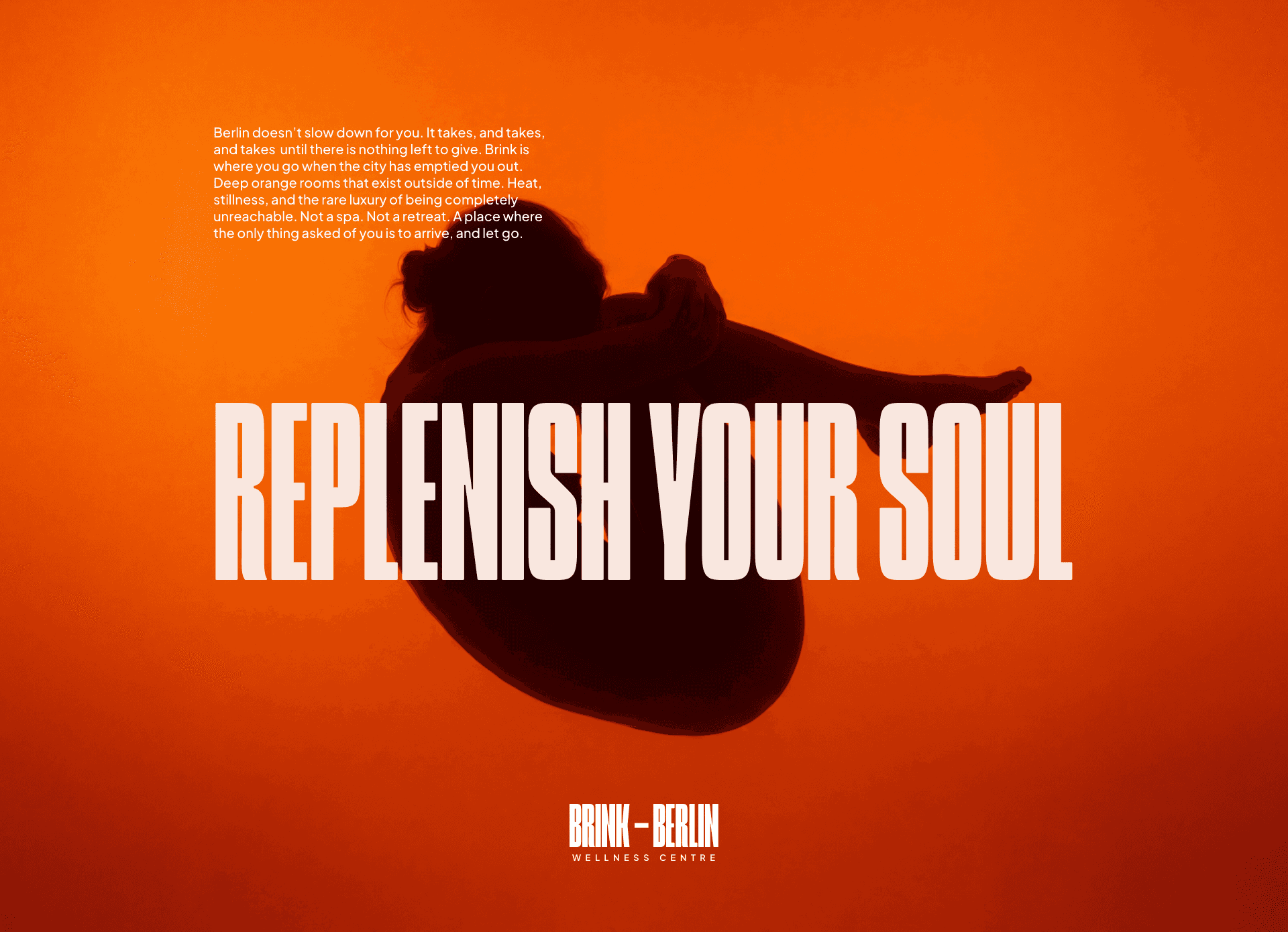
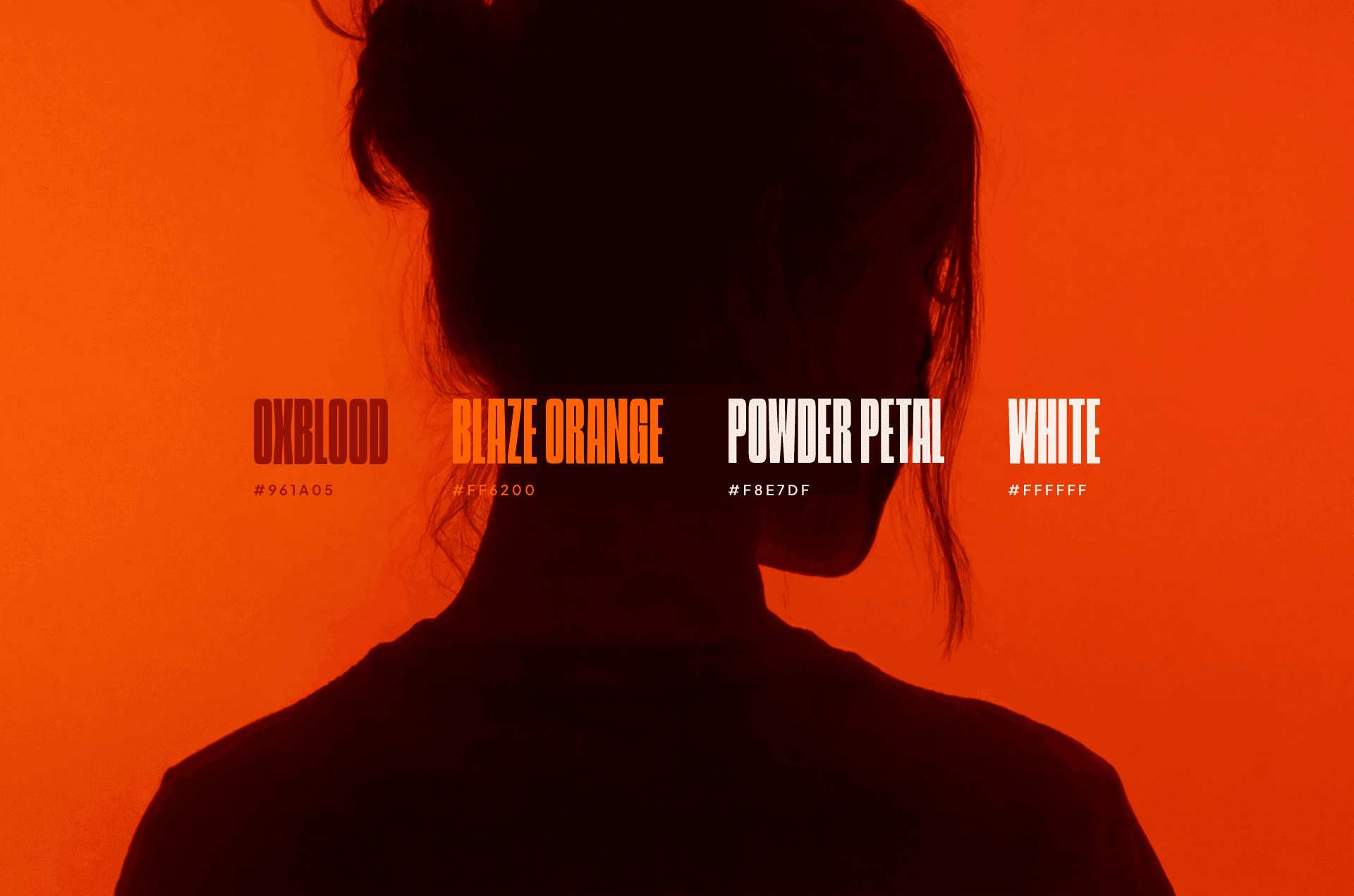
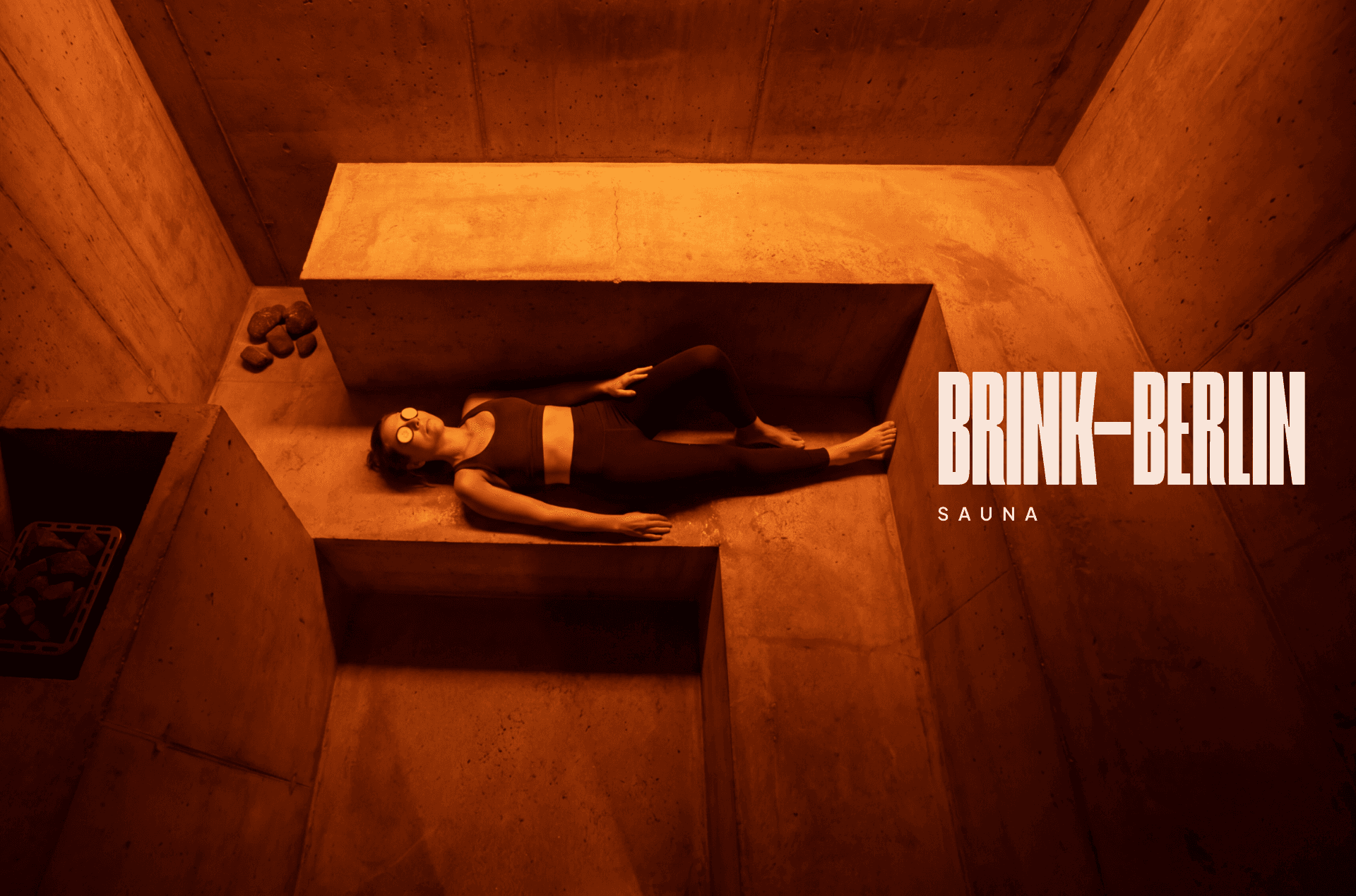
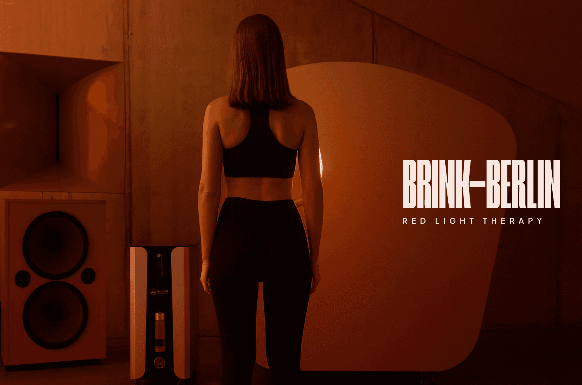
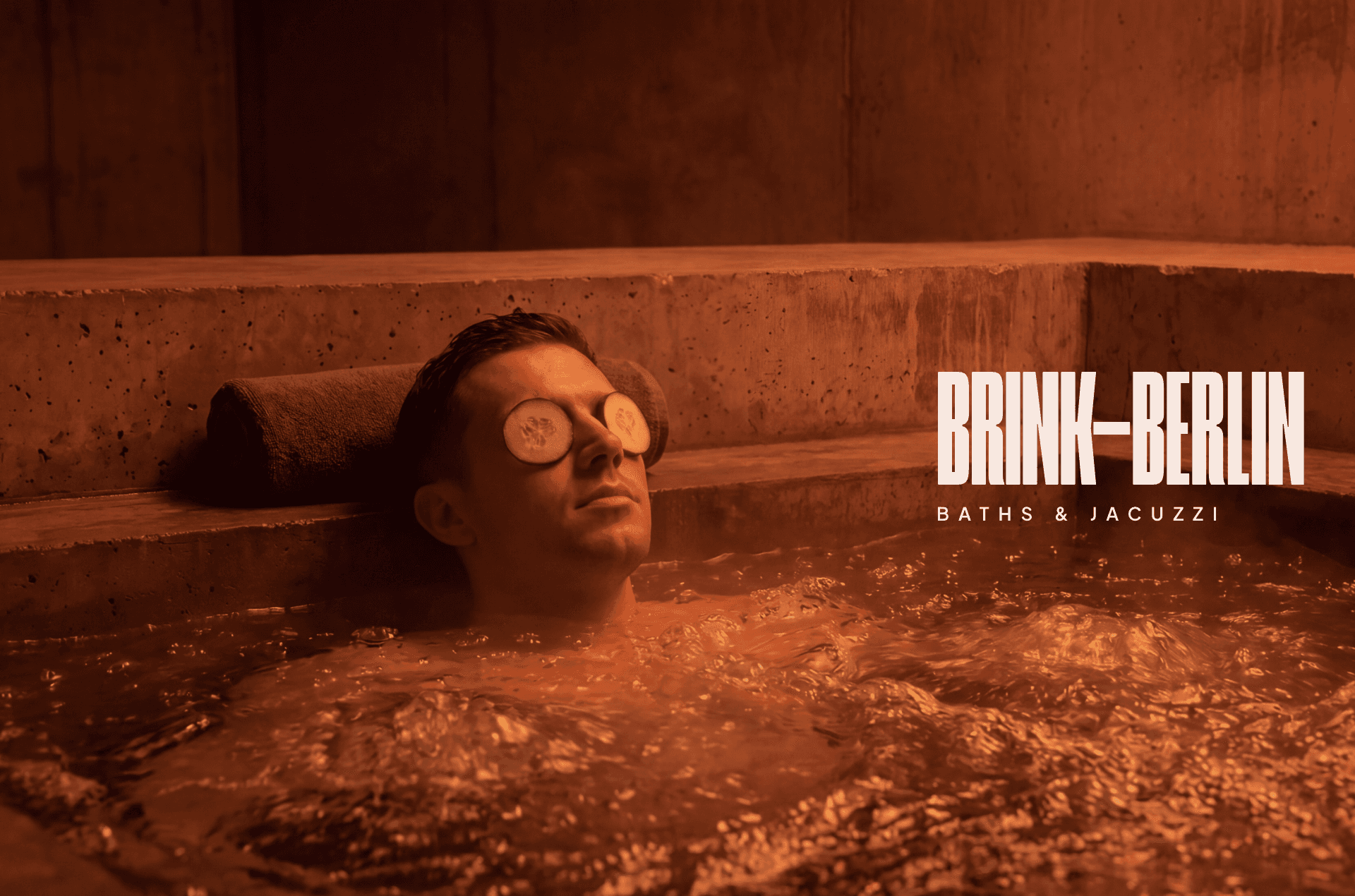
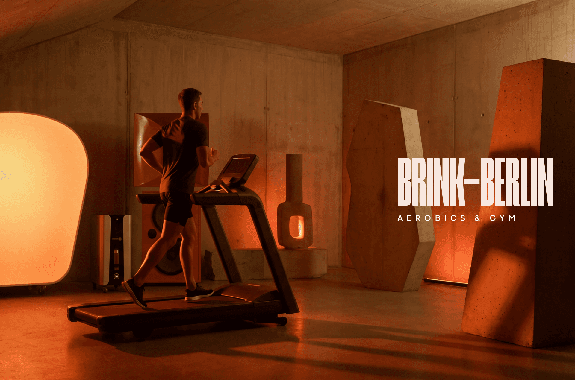
The central creative tension was this: every conventional wellness reference communicates escape through lushness — greenery, candlelight, flowing water. That language is overused to the point of invisibility, and worse, it places demands on the viewer's imagination. I needed an identity that didn't ask you to picture relaxation, but delivered it as a direct sensory hit. The direction I committed to was the void — large, warm, almost featureless expanses of deep orange and red that function less like branding and more like an environment. A colour chosen not for trend but for biology: orange in a grey northern city is warmth, serotonin, fire. It doesn't need to be explained. It just works on you.
Typography was treated as an extension of the mental state the space is designed to create. Brutalist, clean, and unambiguous — legible to someone running on empty. No cursive flourishes demanding interpretation, no layered visual complexity. Where softness appears it is measured and deliberate, a breath rather than a gesture. The typeface does not perform wellness at you. The photography direction follows the same logic but adds a cinematic and expressionist dimension: facilities rendered as though they exist outside of time, framed with the kind of considered composition that makes a person want to be photographed inside the space. The visual world of Brink is somewhere you go and document, because it looks like nowhere else in the city.
The final identity holds together as a single coherent world — abstract, warm, slightly surreal, demanding nothing. It communicates exclusivity not through opulence but through restraint: private rooms, serious equipment, a colour palette that feels like it was designed for your nervous system. The art direction positions Brink not as a luxury spa competing on amenities, but as a psychological proposition. A place outside of space and time is a bold promise. The identity was built to make that promise feel completely credible before a single person walks through the door.
year
2026
timeframe
14 days
tools
Affinity, Figma, Weavy, Framer
category
Branding & Framer Web Design
01
02
03
04
05
06
07
08
09