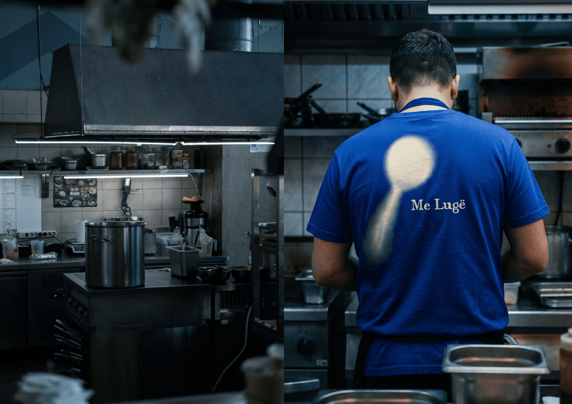
Me Lugë
A local Berlin neighbourhood restaurant specialising in Kosovar cuisine
00

problem
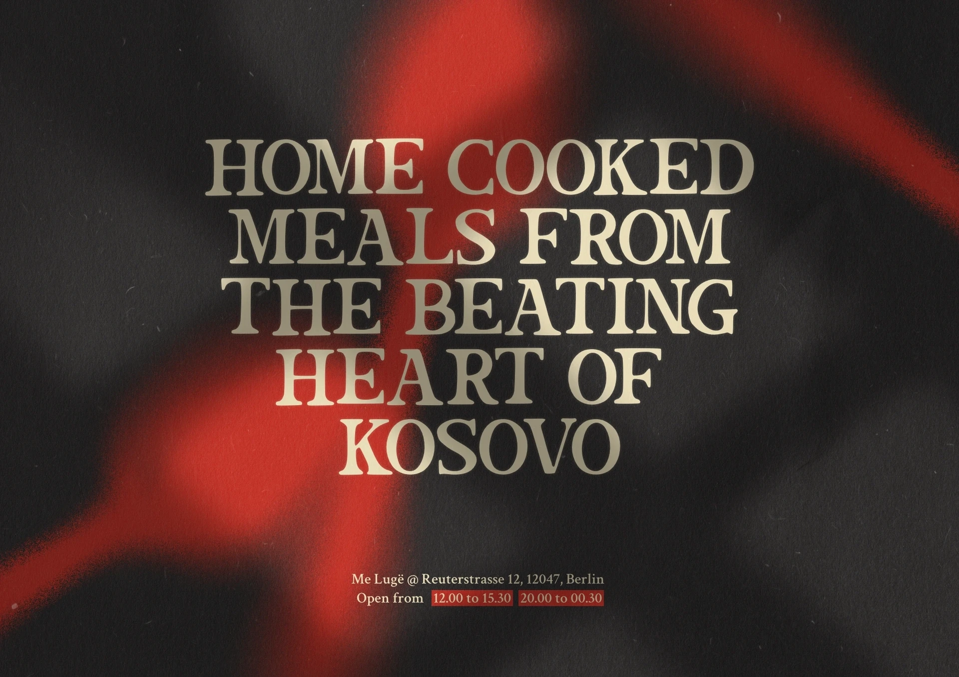
Berlin has a significant Albanian diaspora, yet Kosovar cuisine had no visible presence in the city's restaurant scene. There was no venue that spoke to that community with confidence, and none that made the culture accessible or inviting to outsiders. The brief was to build a brand from scratch that could do both — feel authentic to the community it represented, and compelling enough to bring everyone else to the table.
solution
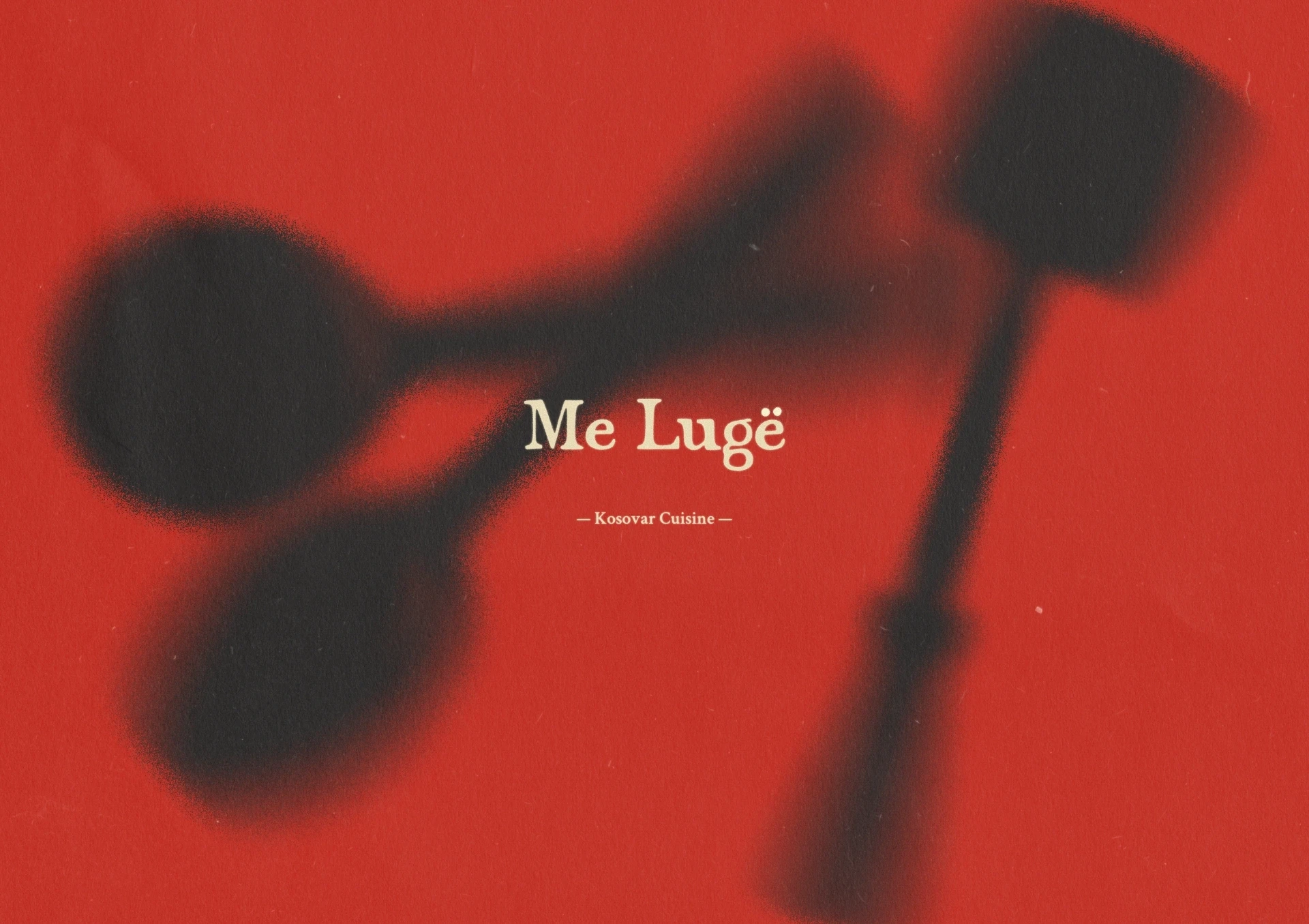
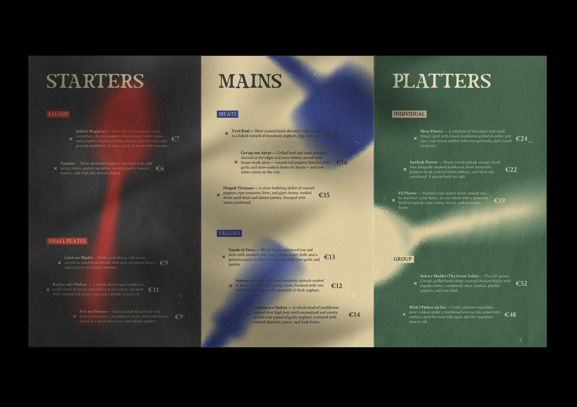
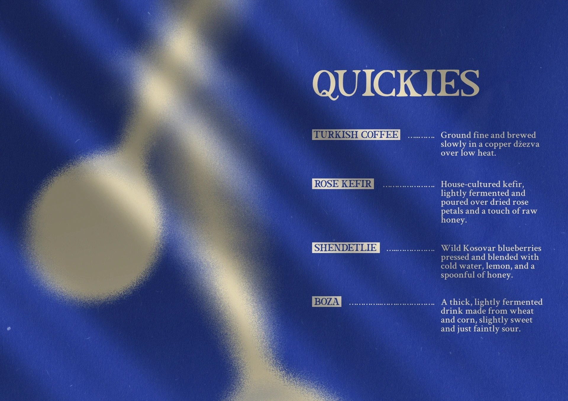
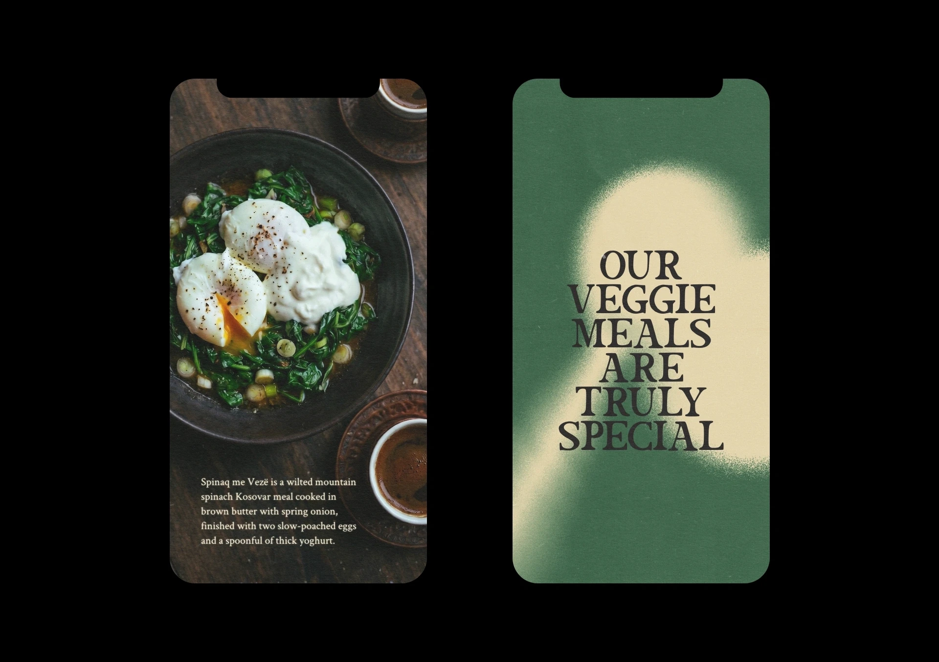
The brand centres on a single object: the spoon. In Albanian, lugë. Simple, universal, and deliberately humble — it became the cornerstone of the entire identity. Rather than just illustrating it, the spoon was expressed in motion and treated with grain and blur, giving the visual mark a sense of kinetic energy and the lived experience of Kosovar culture, that a static logo alone could never achieve.
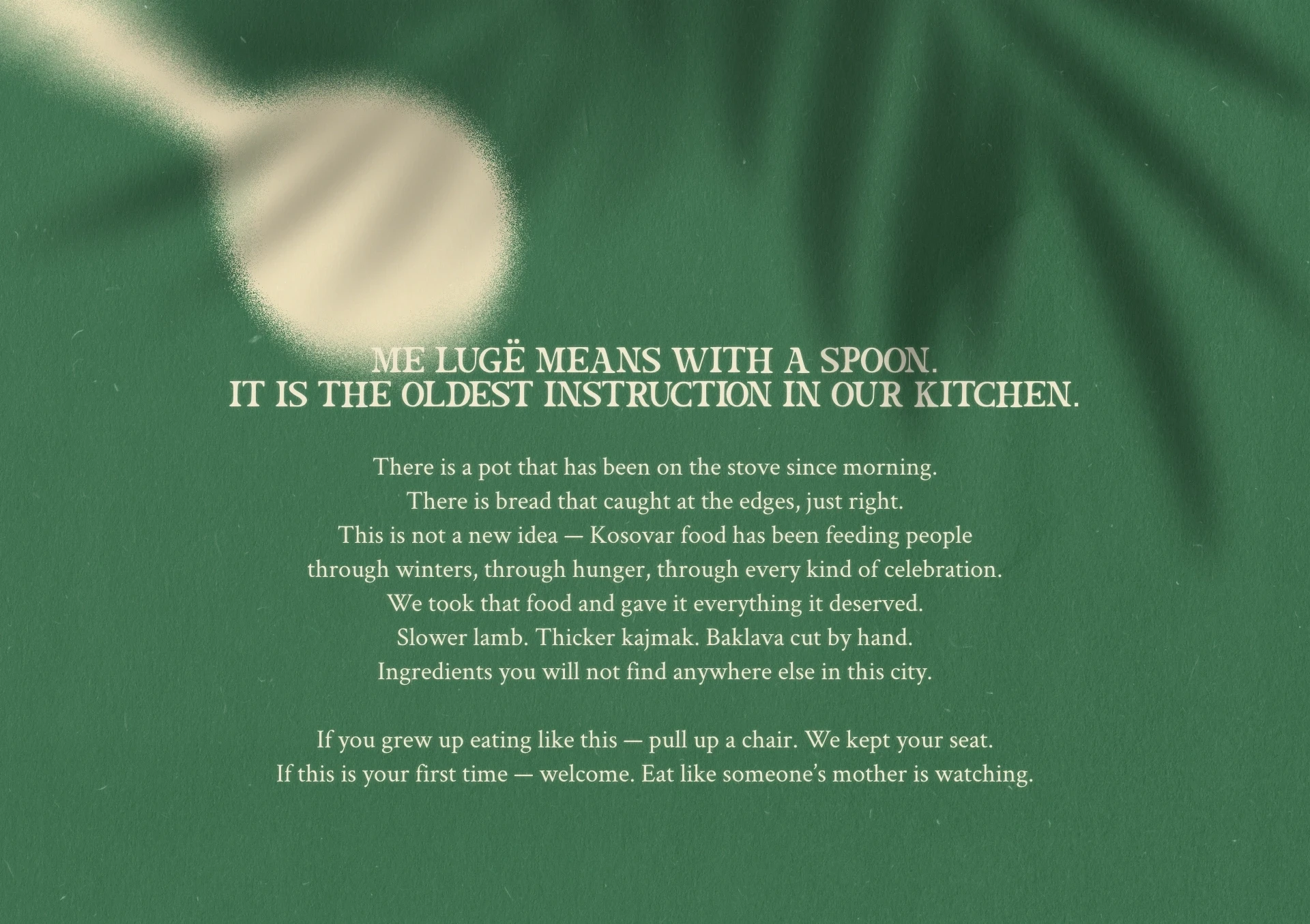
Kosovo has always had a seat at the table. Me Lugë just made it visible. Built for a community that never needed an introduction to each other, and designed to give everyone else one — the brand carries the warmth, confidence, and kinetic energy of a culture that has always expressed itself most honestly through food. This is what it looks like when a cuisine stops being a hidden gem and and starts taking up the space it deserves.

Every design decision was made in service of a single strategic goal: to position Kosovar culture as something vivid, confident, and worth celebrating — not a hidden gem, but a loud one.
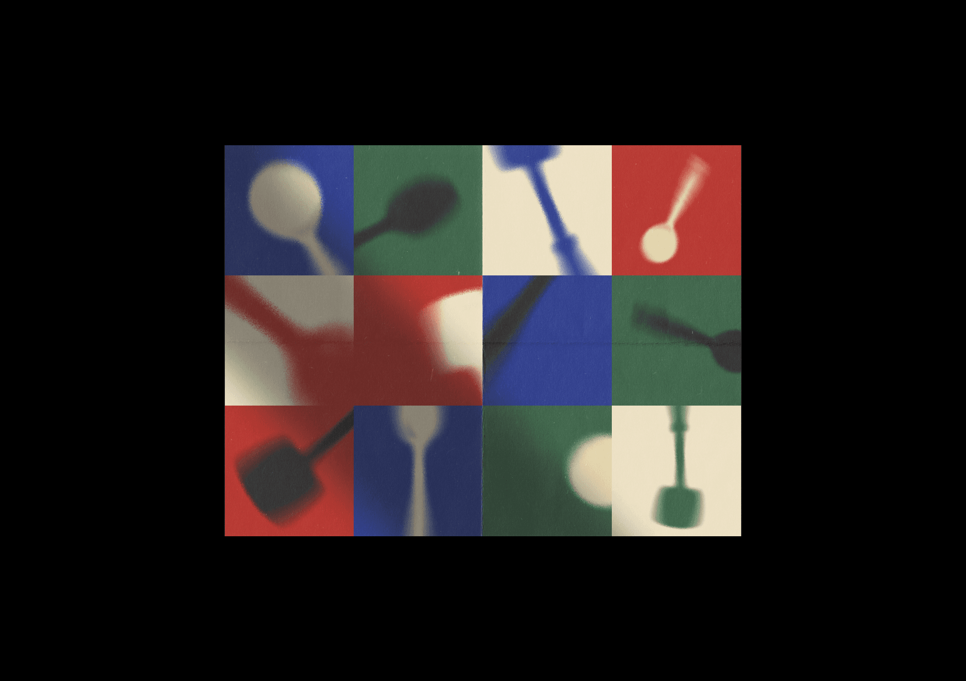
The spoon is the brand mark, but it is never still. Blurred, grainy, caught mid-movement — it carries the energy of a community that is always moving: abroad, through careers, back home, forward. Kosovo is not a quiet place. It is vivid, social, and kinetic, and the identity reflects that.
The colour system runs five values across two tiers. The primary trio — cobalt blue, signal red, and forest green — each carry a distinct role within the identity, preventing the palette from feeling decorative and giving every composition a clear hierarchy. The secondaries, a warm off-white and a near-black, provide the surfaces everything else lives on: light and grounded, never sterile. The result is a system that feels rich without being busy, and culturally rooted without leaning on cliché.
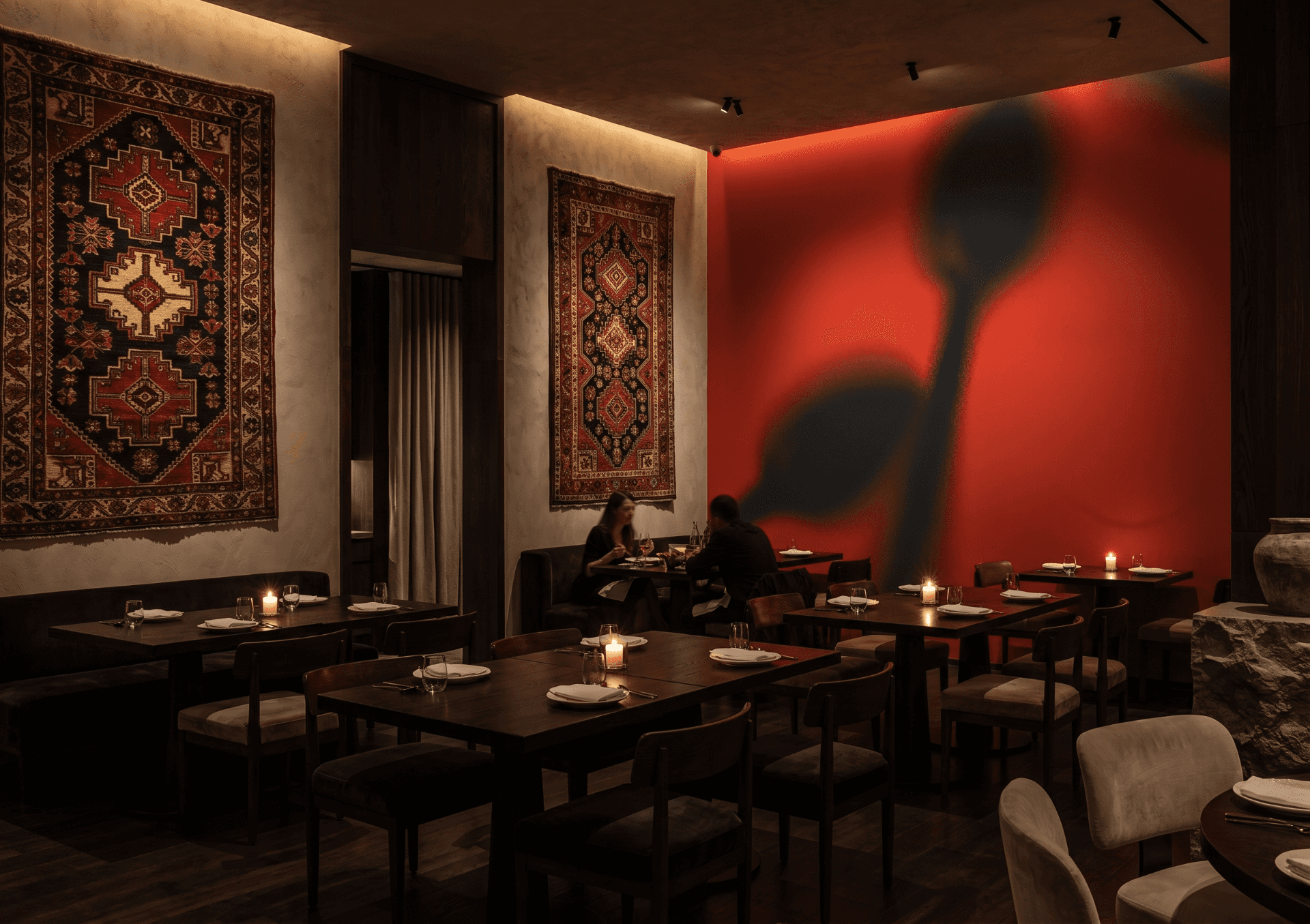
The motion treatment applied to the spoon mark carries through consistently across all materials. On the menu cover it reads as graphic and editorial. Scaled up to the dining room wall, it becomes architectural — the same mark, the same logic, operating at a completely different scale without losing anything. That consistency was the test the identity had to pass.
The interior concept reinforced the brand language in physical space: Albanian kilim rugs against raw plaster, dark wood tables, candlelight. Familiar materials handled with intention. The result is an environment that feels rooted in culture without relying on nostalgia — warm and specific, but modern enough to speak to anyone walking in off the street for the first time.
year
2025
timeframe
14 days
tools
Affinity Designer, Figma
category
Branding & Framer Web Design
01
02
03
04
05
06
07
08
09
010