Nucleus
Brand identity, product design, and creative direction for Nucleus — a new kind of audio hardware company, designed from the signal chain up.
00

problem
Boutique audio hardware has a control problem. The most capable processors on the market bury their depth behind shift functions, sub-menus, and colour-coded button combinations that require a manual to decode. Players adapt, but they shouldn't have to. The moment a musician reaches for a device and has to think about the interface, the instrument has already failed them. Price compounds the issue — the products that do the most tend to cost the most, placing serious sound design tools outside reach for the people who would use them hardest.
solution
Nucleus was designed from the signal chain outward. Every parameter on every effect has a dedicated physical control — always visible, always reachable, never shared. The interface doesn't require learning because there is nothing to learn. The brand identity follows the same logic: built from the product itself rather than applied to it, rooted in a conceptual frame that made the naming, the logo, and the colour system feel inevitable rather than designed.
The brief was simple: build the tool that doesn't exist yet. Not a simpler version of something expensive, not a cheaper version of something deep — the thing that is genuinely both. The brand followed once the product was honest about what it was trying to do, which turned out to be the most useful brief a visual identity can have.
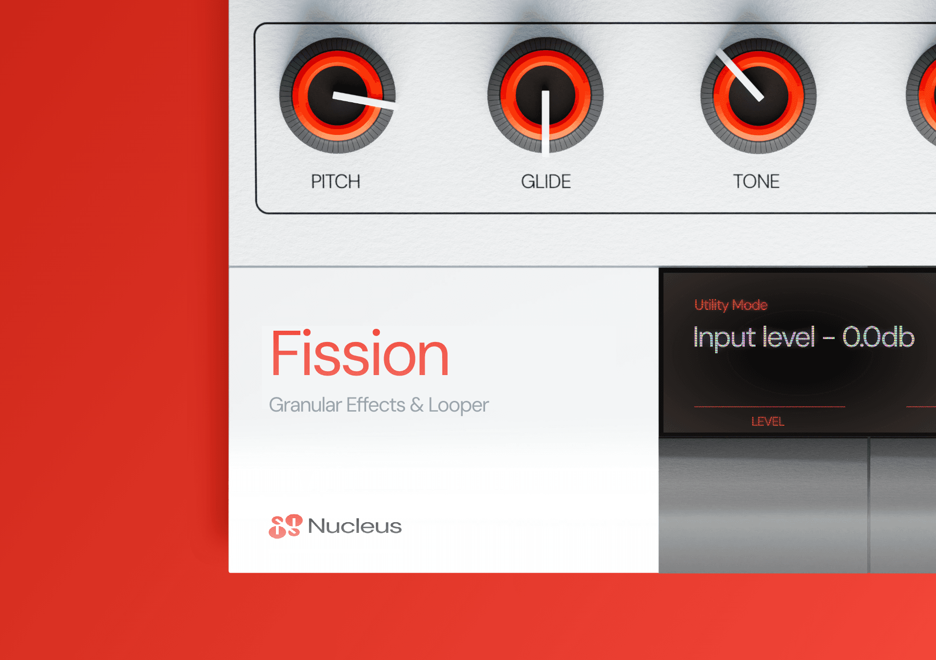
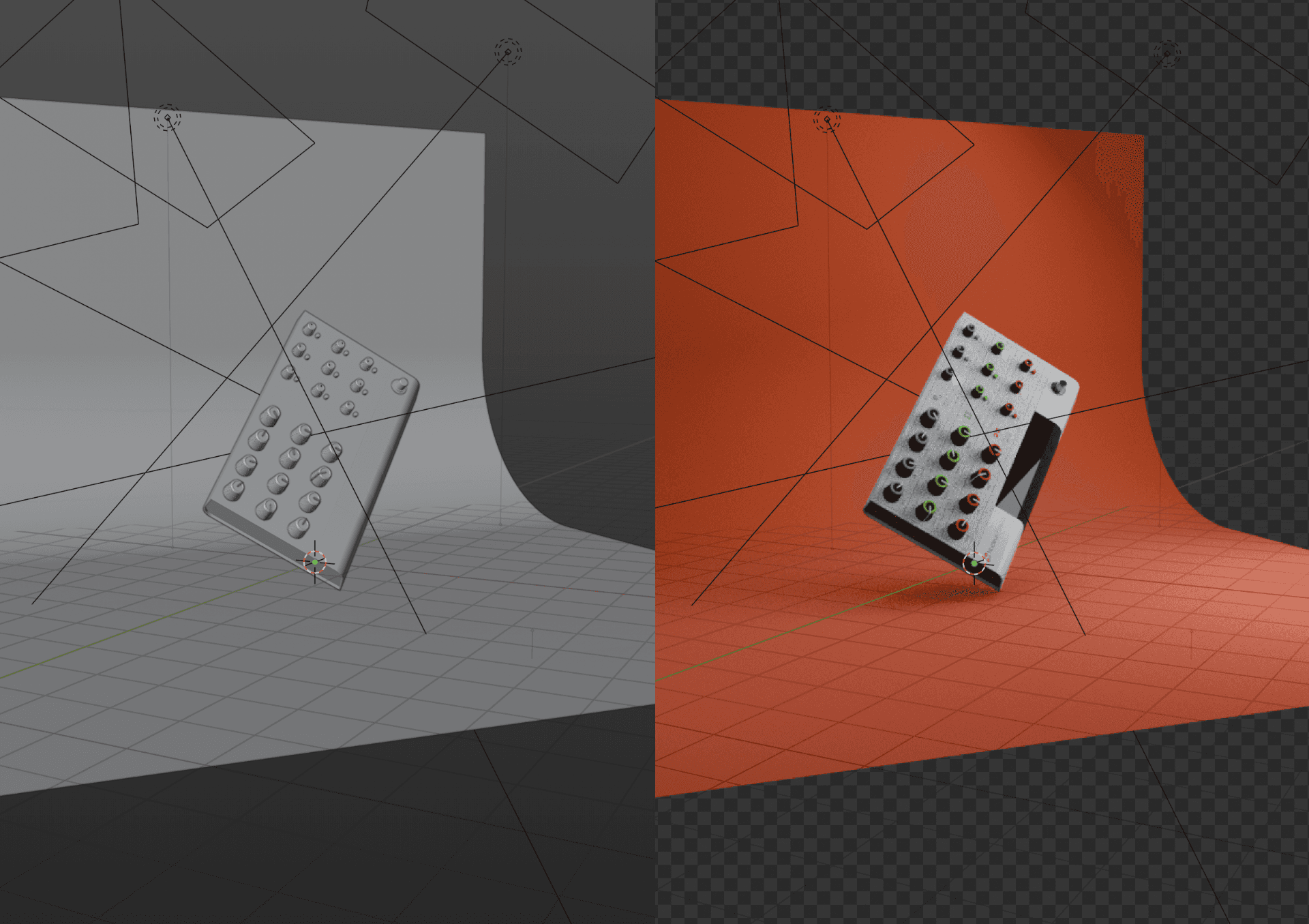
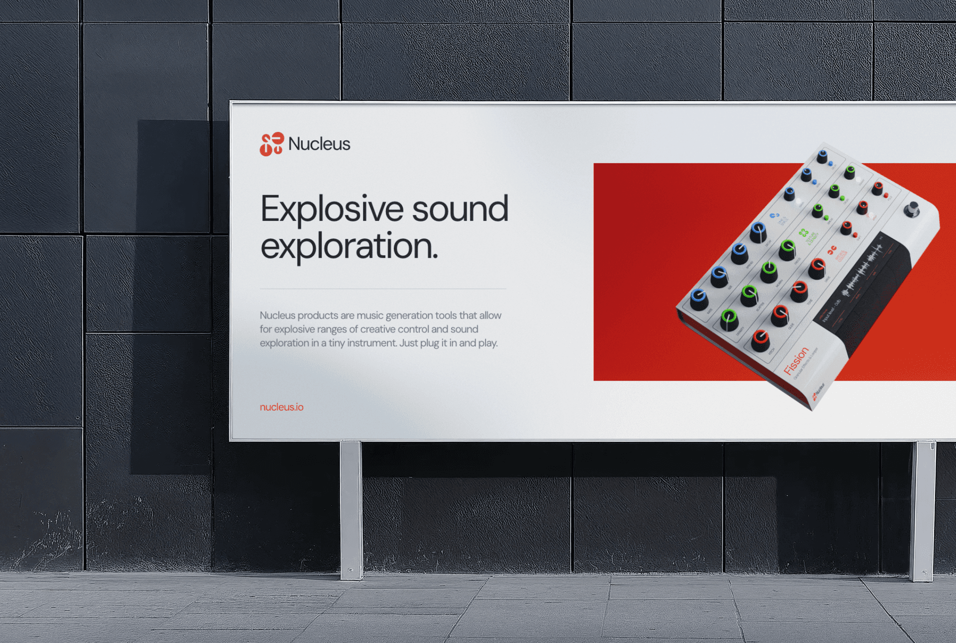
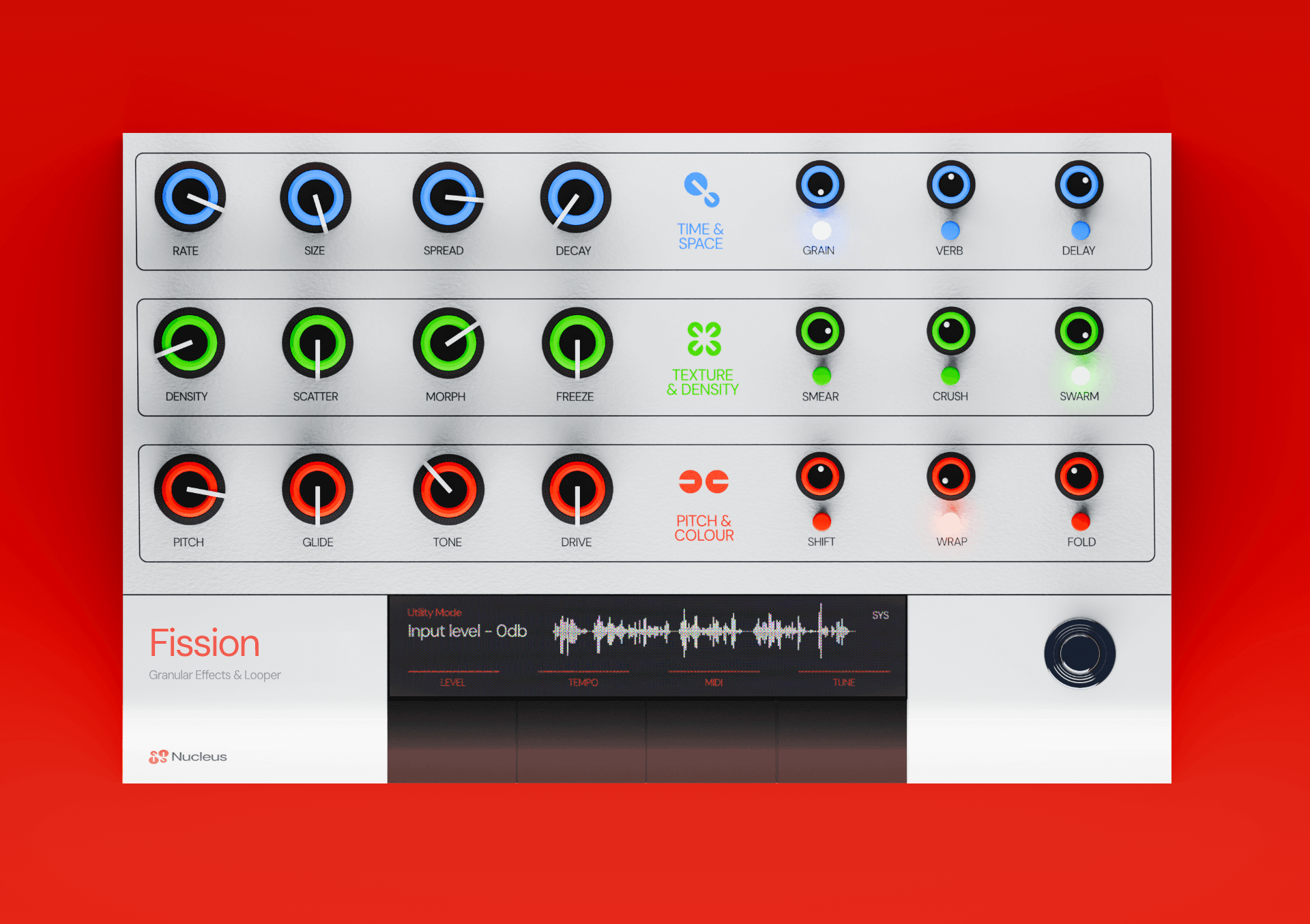
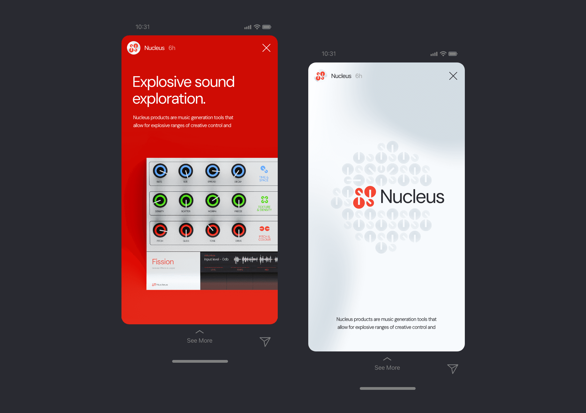
Fission is the first Nucleus instrument — a granular effects processor and looper with nine chained effects, twenty-one dedicated knobs, and a context-sensitive LCD system that handles the complexity without surfacing it. The design brief was essentially a single constraint: total physical transparency. No parameter should require more than one hand movement to reach. That constraint shaped the panel architecture — three rows, each row its own effects domain, each domain colour-coded so the layout reads immediately without annotation. The product resolved itself once the constraint was clearly stated. That kind of clarity tends to happen when you design for use rather than for specification.
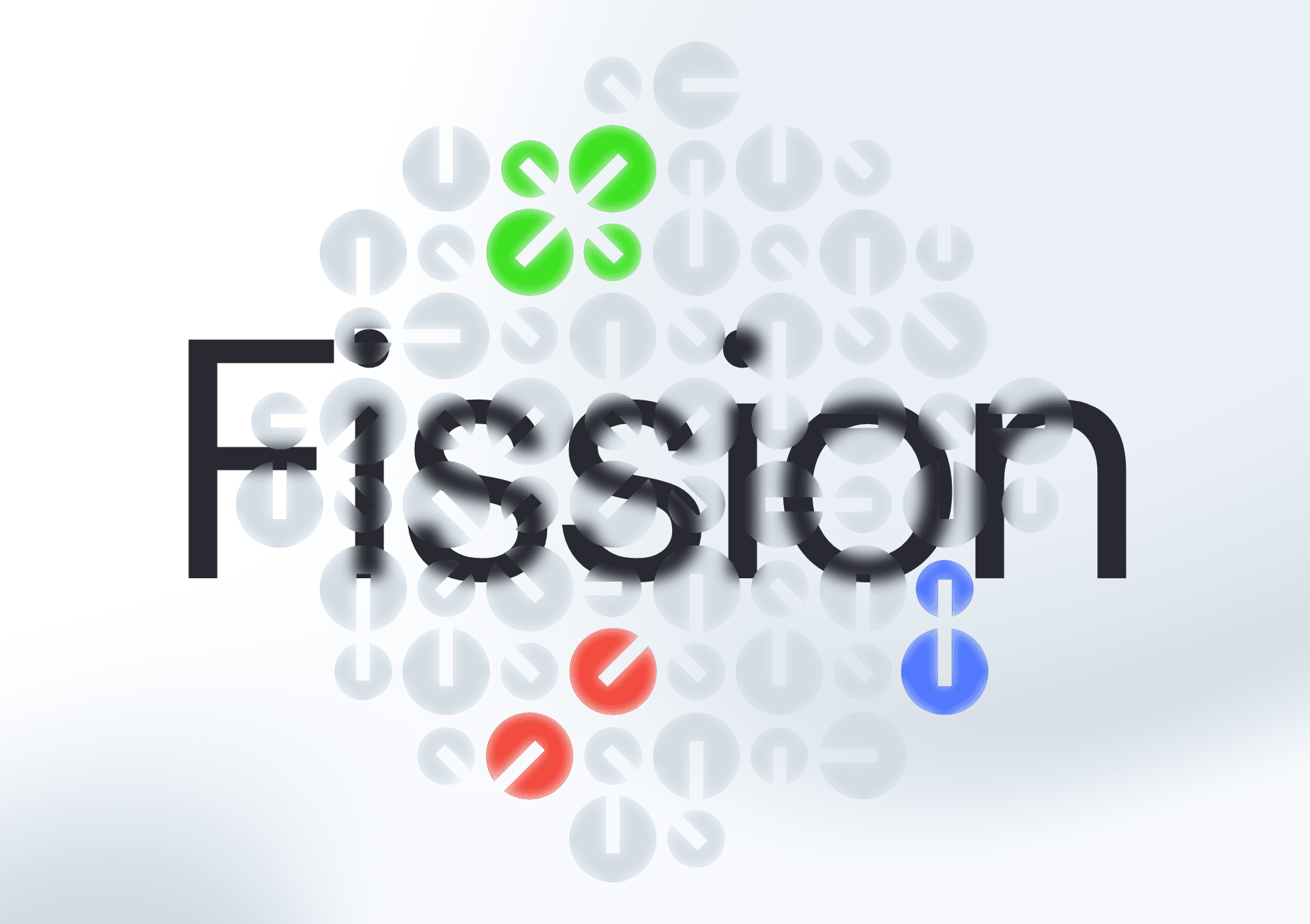
The brand came from spending enough time with the product to understand what it actually was. Sound behaves the way physical systems do — in chains, in reactions, in component relationships where everything downstream is changed by everything upstream. That felt like the right conceptual register, not as a marketing angle but as an accurate description of what the hardware does. Nucleus named the structure. The atomic naming extended naturally into the product line — Fission first, Proton next — because the parallel held up.
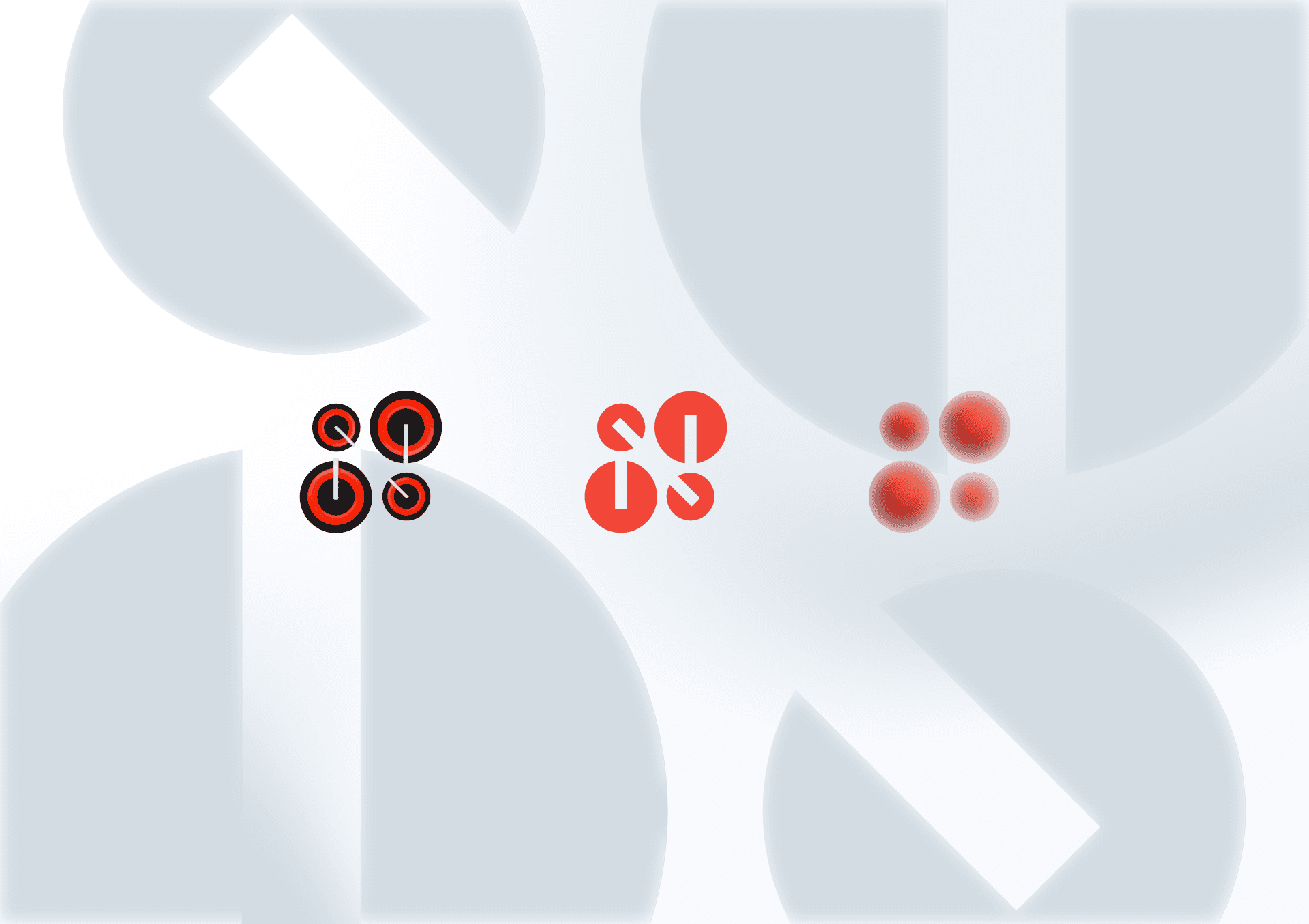
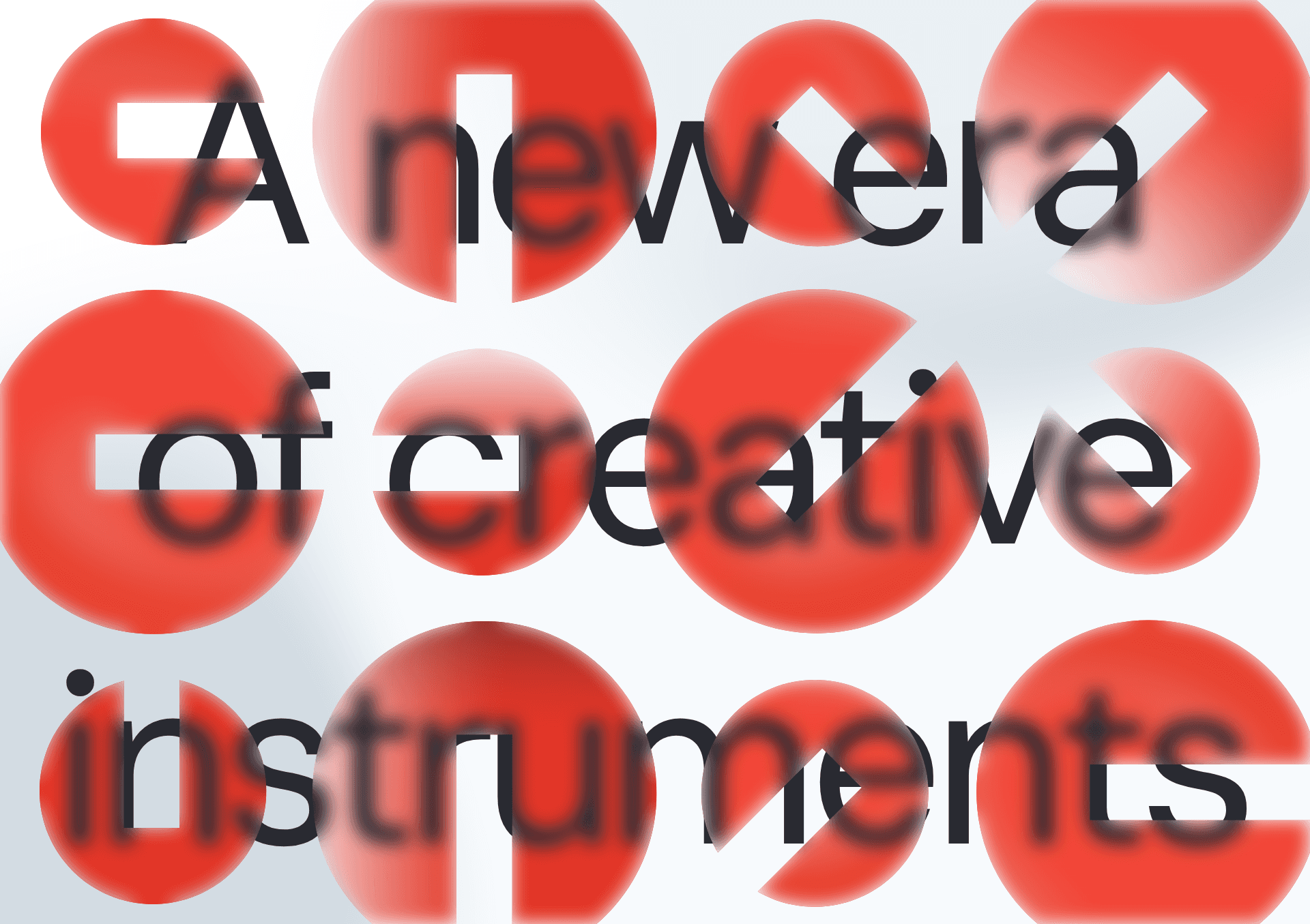
The logo was drawn from the knobs directly: four circular forms that compress into an N and read simultaneously as an atomic diagram and a physical component. It was not a difficult logo to design once the idea was clear. The brand red was chosen first as the product's primary accent — the ring colour on the third row, the warmest and most expressive layer of the instrument — and extended outward into the identity from there. Complementary colours were developed for the full system but held in reserve. The mark, the name, the colour, and the product exist in the same logic. That coherence is not accidental, but it was not laboured either.
year
2026
timeframe
1 month
tools
Affinity Suite, Blender, Figma
category
Branding and Identity
01
02
03
04
05
06
07
08
09
010