Berlin Sci-Fi Filmfest
Rebranding a sci-fi film festival that believes the future is complicated and not doomed.
Case Study
problem
Science fiction as a genre currently means dystopia by default. A festival programming the opposite has to fight its own category's visual vocabulary before it says anything about its films — the design has to argue for a different kind of future, a complex but fundamentally bright future, before anyone reads a single synopsis.
solution
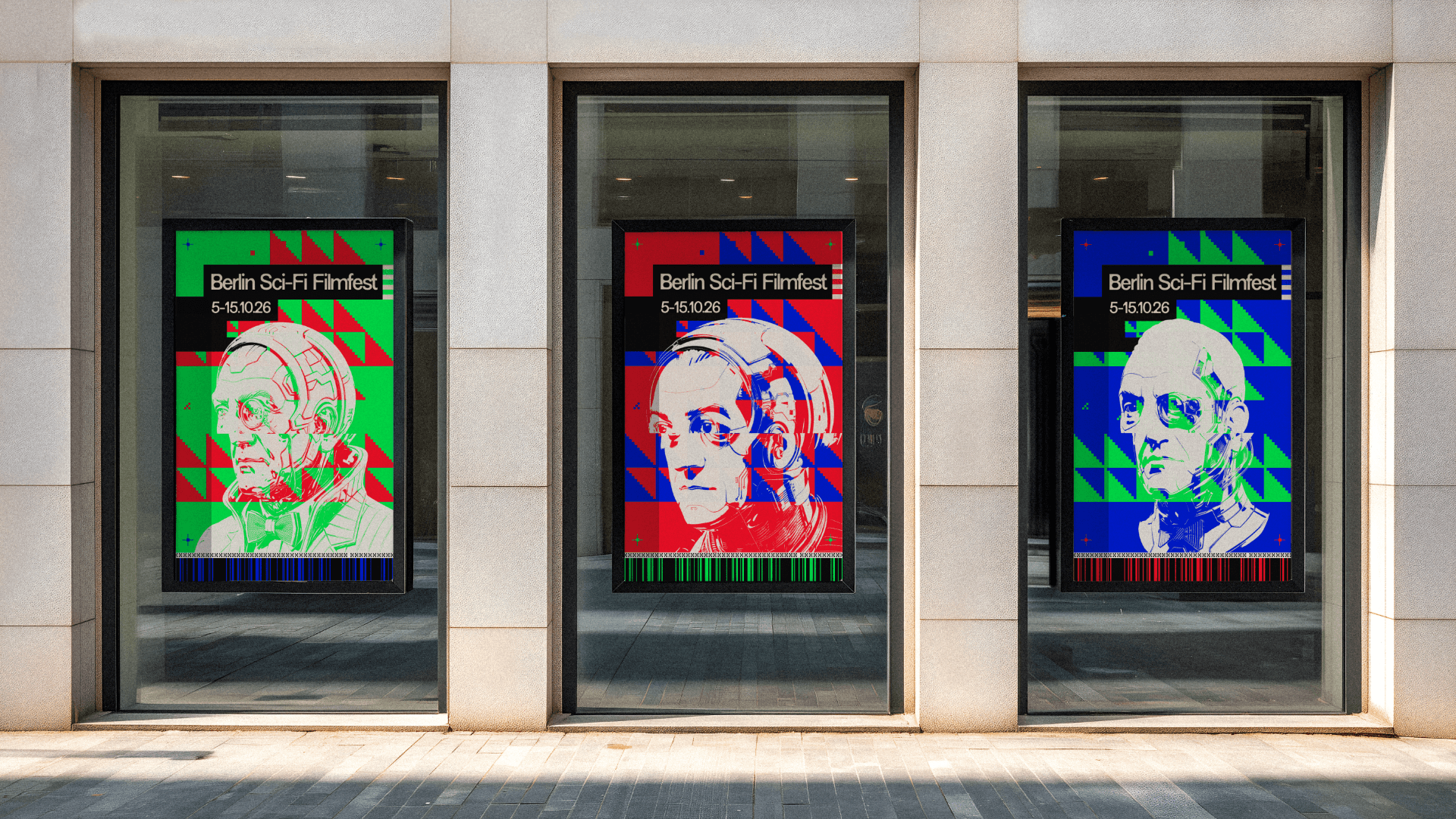
Frederick the Great (or Fritz), a Prussian king who governed for peace and human liberation, relocated into the machine. Not a warning about technology — a mind inside it, encountering complexity it was never built to hold and finding that astonishing rather than threatening. The future as something worth looking at closely. That single reframing is the entire brand.
The brand doesn't just depict a digital consciousness. It behaves like one.
The system is one fixed element surrounded by total instability. Fritz's head is the constant; the material never is. He appears as flat vector, rendered dimension, transparent shell, raw code — a self with no fixed substrate, which is what a consciousness becomes once it lives in a machine. Around him the compositions fracture, multiply, glitch and reassemble, and the chaos is structural rather than decorative. Something genuinely thinking doesn't hold still. What binds it is never the rendering, it's the colour: additive RGB, the native palette of screens, projectors and signal, the actual substance he now inhabits, held together by a grammar of UI fragments, repeating patterns and digital debris that can sit quietly on a badge or detonate across a stage backdrop.

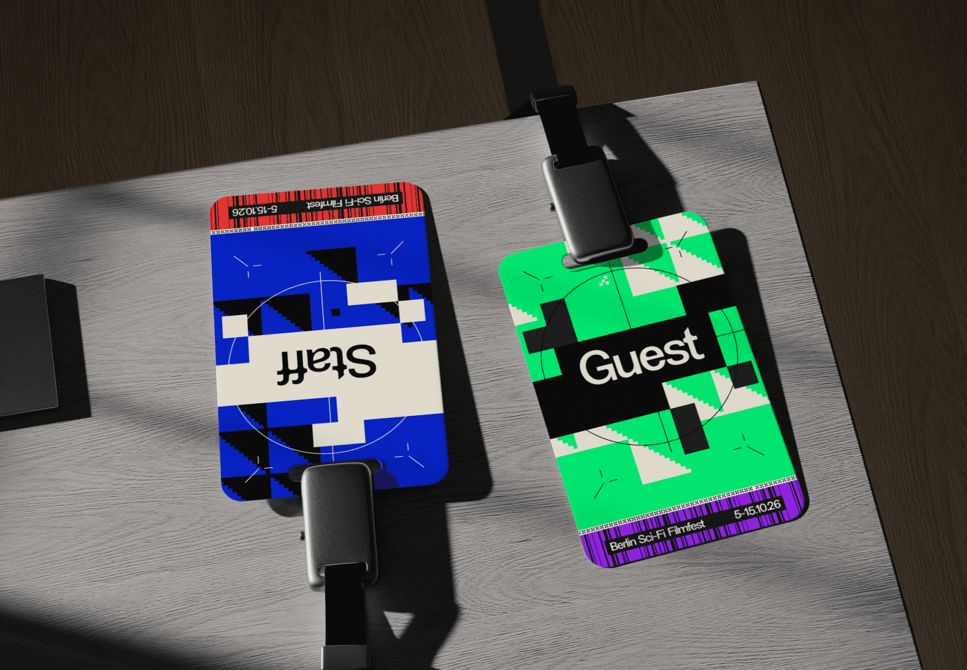
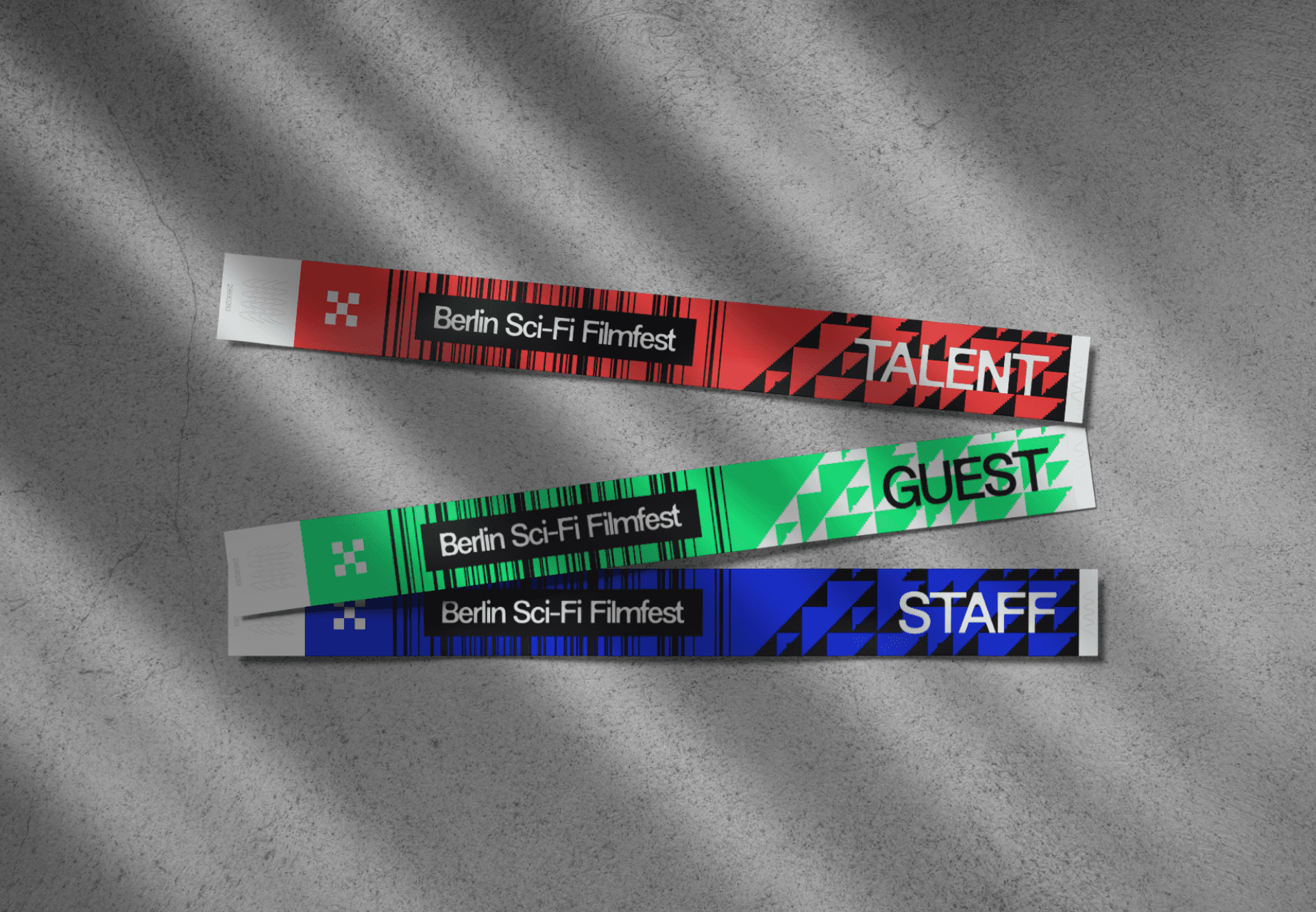
That gives a two-person team an identity they can run for a year without opening a 3D file. The same RGB rotation that generates endless variation from a single composition also codes the accreditation — Talent, Press, Guest, Staff across four channels, readable at ten metres in a dark lobby, which is the only job a badge has. Against all that motion the typography holds completely still: black bar, hard grotesque, name and dates. In a composition coming apart, the type is the one plane the eye can rest on, and it means the brand still works with no image at all. The laurel travels furthest of anything, living at forty millimetres on other people's posters and reels, so it was cut from the same grammar and proven at that size across the full channel set plus white and black.
objectives
Launching October 2026, measured against seats filled for feature screenings, submission volume for the next cycle, and audience fit — drawing people who came for a complicated, liveable future rather than a ruined one. The third is the measure the art direction owns, and the reason the identity refuses the genre's default language entirely.
year
2026
timeframe
1 month
tools
Affinity Suite, Figma
category
Film festival brand identity
01

02
03
04

05

06

07

08